
 |
| Click for larger version |
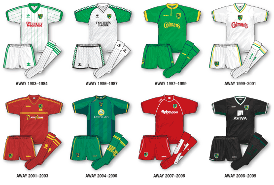
It featured the mid-2000's trend for asymmetry with the fairly discrete Xara logo jauntily placed high to ensure, despite its relatively diminutive stature, its inclusion in all ‘head and shoulders’ player photos. The placement of this logo and the subsequent central position of the club badge and Lotus Cars sponsor logo gave them both added prominence.
The asymmetrical approach continued with the yellow-trimmed crew neck that seemed to have been rotated 45 degrees in a ground breaking move that was miles away design-wise from anything else going on at the time.
One of the key elements in this kit’s success was the colour. Norwich away strips have traditionally been white, or occasionally red, yet many fans have often questioned why the club seldom utilised their prominent secondary colour, green, as a change option. Perhaps its stigma as an unlucky hue had something to do with it? (Norwich’s results in this strip may bear that theory out).
However, green kits had began to pop up now and again in the Carrow Road kitbag since the late '90s but now, for the first time, rather than the more familiar ‘emerald green’ a ‘Racing Green’ shade was chosen. The colour, rendered in three beautiful tones was a nod to the impressive racing heritage of Lotus Cars who were actively involved in the creation of the design – one of the first times such a collaboration between club and sponsor had occurred. The multi-tonal approach to colour, which Xara pioneered with this strip, has also subsequently become the norm with many major sportswear designers today.
The kit just oozed class, and the fact that it was produced by a relatively small company (at the time their offices were in Scotland but today the parent brand focuses primarily on the US market) shows how less famous brands can sometimes really punch above their weight when it comes to innovation, elegance and style.
Written by John Devlin, founder and illustrator of TrueColoursFootballKits.com.
John can be found on Twitter and True Colours is also on Facebook.
This shirt is part of The 50 Greatest Football Shirts Ever. The full list can be viewed here.


0 comments:
Post a Comment