Shoot! magazine's 'Focus' feature is legendary. Essentially an interview with a football player using the same basic questions every week, it often provided an interesting insight into their life and interests.
All very honourable on the part of Shoot! but what about us football fans? More to the point, what about the thousands of bloggers and podcasters that truly make the world of football go round these days? Shouldn't they be celebrated for their achievements too?
Here at The Football Attic, we decided it was time to answer that question in the positive, so we created a regular 'Focus' feature of our own called 'Focus On...' - and you're invited to be a part of it!
If you're a football blogger or podcaster, here's what to do. Simply go to our feedback form, fill in as many or as few of the boxes as you like, send us a picture of yourself and with any luck you'll be appearing here on The Football Attic's 'Focus On' feature at some point in the not too distant future!
When it comes to answering the questions on our form, please ensure that your answers aren't too lengthy or too heavily reliant on obscene language! Similarly, when you reach the question 'Favourite Food', we realise it will be tempting to type 'Steak and chips' in an ironic 'retro' sort of way, but please refrain from doing so unless it really is your favourite food! Finally, please be aware that we may edit some of your text for brevity or to correct spelling/grammar where necessary. We'll try not to, but sometimes it might be unavoidably necessary.
As you can see from the image above, a key part of the old 'Focus' feature was a picture of the player being interviewed, so in order to remain true to the tradition, we'd like you to send us a picture of yourself once you've filled out the feedback form (not necessarily in full kit, you'll be pleased to hear). Please email your photo to admin [at] thefootballattic [dot] com and we'll do the rest.
So there you go - football bloggers and podcasters, now's the chance to find out more about your peers... but it'll only happen if you step forward and take part!
Many thanks in advance for your participation in this fun little project of ours. With your help, we're sure you'll help us make it a great success!
I'm not going to sugar coat what I'm about to say. This is without doubt one of the worst football picture card collections you will ever find.
Because of that, however, it is also one of the best card collections you will ever find, because from the moment you set eyes on it, you'll hardly stop laughing.
Almost everything about this item is wrong. Essentially a modern-day collection of football cigarette cards, The Sun, in its infinite wisdom, decided it was time to bring back the once popular nicotine-related pastime for kids - even though they were already being tempted by self-adhesive stickers. A noble move by the popular tabloid, but that would be the very peak of any credibility the project would attain.
Something doesn't add up...
"There are 1,000 different cards... Each card is a full colour drawing" proclaimed The Sun. So many cards to collect, and perhaps that's why they had to be sold in packs of FIFTY at a time. As a proud member of the Panini generation, my mind boggles at the prospect of a pack of football pictures containing ten times the normal amount. Oh to see some pictorial evidence of that...
Such a large number of cards needed not just one album to display them in but four. At this point, you're probably already doing the math... 1,000 cards divided by four albums = 250 cards per album, right? Wrong. The Sun, ever attentive to detail, allowed only 150 cards to be mounted in each of their albums. Nice work.
Fun with gum
Although each of the albums and the cards themselves were individually numbered, the spaces inside the albums were not, which meant you could affix any cards you liked, wherever you liked. In addition, each card had a biography of a player on the reverse, thereby inviting you to be particularly creative with the glue if you wanted to read the blurb after the card was fixed in place.
Stars?
Somewhat helpfully, each of the cards was listed inside every album so you could check which ones you still needed to collect. Unfortunately it only served to expose the highly dubious way some of the players were categorised. Take the 'International Stars' section, for instance. There were 200 of those, among which were worldwide stars such as Joe Harper of Scotland (4 caps), Pat Sharkey of Northern Ireland (1 cap) and Eric Pecout of France (5 caps). There were also Brazilian players that were so famous, they didn't even need to be spelled correctly, like Riverlinho, Dirceau and Emerson Leoa.
The humorously entitled 'International Stars' listing
The rest of the listing continued in much the same vein. In the 'All Time Greats' section were 347 players including such legends as Paul Edwards of Stockport County, Kevin Bird of Mansfield Town and Alan Dugdale of Charlton Athletic. After assessing the selection of 'Midfielders' and 'Strikers' (goalkeepers and defenders weren't worthy of inclusion, apparently), there was also a subset of 60 national flags to collect, because that was absolutely essential in a collection of football player cards.
A case of mistaken identity
But what about the actual picture cards themselves, we hear you cry? What unfettered joy were they capable of bringing into our lives during the late-1970s? In short, they were as bewilderingly awful as they were hysterically funny. One can only assume some poor amateur artist was approached by a Sun employee and asked if he could paint pictures of almost 1,000 football players in the space of a day and a half, on account of it being 'a bit urgent.' The poor fella no doubt weighed up the situation and figured it was more important to get them all done rather than make them lifelike in any way. The results were, let's say... 'interesting.'
Oi... Narey... get your hair cut...
To begin with, several of the players were situated so low down in the frame that you'd be mistaken for thinking they'd been cut off at the knees. For others, a curious selection of colours was applied to render many a club shirt unrecognisable in a psychedelic sort of way.
The part of Peter Springett will this evening be played by
Sean Connery in Zardoz.
If the colours were right by some strange quirk of fate, many a detail on the shirt wasn't. On occasions, a player was seen wearing a shirt for a completely different team, but hey, we're just splitting hairs here.
No, you're not mistaken... that really IS Mick McCarthy
(top right)
Look at his face! JUST LOOK AT HIS FACE!
But let's not kid ourselves. The real reason to point and laugh uncontrollably up our sleeves wasn't anything to do with the shirts. It was the mangled, often contorted-as-if-reeling-from-an-accident-with-a-food-blender depiction of the face and hair.
At what point can a man with the grooming and elan of Watford goalkeeper Andy Rankin be robbed of his self-esteem purely because The Sun's resident artist thought he looked like a grapefruit wearing a wig?
Wait a minute... haven't we seen him before somewhere?
Oh yeah - thought so.
If a player had grey or even blonde hair, heaven help him. Chances are he'd end up looking like he was balancing a small whitewashed mammal on his head, such were the limitations of our esteemed painter.
Les Chapman? For an extra £20, we could have got an
Old English Sheepdog...
Got a player whose face is caught in heavy shadow? Not a problem! Let The Sun depict him as a man with a seriously contagious skin condition. It's the least you deserve as an 'International Star...'
Alan Stevenson, a.k.a. The Singing Detective
...and so it goes on. Page after page of brightly coloured, erratically drawn football players providing a never-ending parade of mirth from cover to cover. But let's be mature and stop for a moment to consider the serious content provided for us by The Sun's professional band of football writers.
Don't make me laugh...
Throughout this album were articles on everything from the World's Biggest Stadiums to Soccer Development Around The World. There was even a lengthy series of texts charting the history of international football from the Second World War onwards. And if that was too challenging for you, there were also quizzes, puzzles and trivia features.
World's Biggest Stadiums: Insert glorified list of statistics
here
Geoff Hurst is the only man to score a hat-trick in a
World Cup Final?!? Amazing!
Football from a bygone era, and Gerry Daly:
an accidental juxtaposition.
But let's be honest - all these articles, no matter how noble they have been in their efforts to educate the reader, were never going to be the main focus. This was purely and simply an attempt to bring comedy to the masses through the medium of art, and we use the term 'art' very, very loosely.
So to close, here's some more badly painted football players of the late-1970's as we salute the ridiculous delusion of a national newspaper that thought it didn't need to pay for some proper photographs. How wrong they were.
We regularly feature guest posts here on the Attic and today sees another, this time by the amiable William Abbs, creator of Saha From The Madding Crowd who takes a look Merlin's first Premier League sticker collections.
One lunchtime at school, a friend whose identity I've sadly forgotten gave me the playground equivalent of magic beans. They were just half a dozen football stickers that he said he had no need for, but they started off my very first collection and one that would grow into a complete set by the end of the 1993/94 season. I didn't quite understand the concept at first - idly swapping stickers with other friends without realising I was giving away players I would need to acquire again later - but I soon realised I'd been given the keys to a whole world of trading, bartering, and one-upmanship.
Once I found out there was a whole album's worth of stickers to get, I started buying them almost on a daily basis. Of course, my parents often bore the cost but my younger brother had agreed to come on board in the collecting so they were at least only funding one collection not two competing ones. I would also think nothing of blowing my weekly £2 pocket money on ten packets all in one go.
Looking back, in relative terms I've never been so profligate with cash as I was during those months. Using my entire weekly income to indulge one obsession at a young age could have had unfortunate repercussions later on, so it's a relief really that football stickers proved to be a gateway to nothing harder than a regrettable dalliance with pogs a year or so later.
Although the Premier League was in its second year, this was actually the first edition of Merlin's sticker collection. The introduction on the first page - penned by Andy Gray, no less - wasted no time in aligning the two brands with the assertion that the album, like the Premier League itself, "breaks with tired, old conventions". That statement seems a lot more ominous now than it did twenty years ago, but that's probably because I was ten at the time so I just skipped straight to the player pages beyond it instead.
Arranged, conventionally enough, in alphabetical order, the twenty-two clubs that made up the Premier League that season were represented by a rather modest fifteen players each. There was also a team photo of every squad to collect as well as a fairly redundant action shot of the side's star player divided across two separate stickers (I lost count of how many copies of Neville Southall's outstretched right boot I had at one time). However, the crowning piece of every team section was obviously the picture of the club's badge on a reflective background. These were universally called "shinies" at my school yet erroneously referred to as "glitters" by those at a rival one, perhaps emphasising the class divide that exists between many Norwich suburbs.
Moving on to the pictures of the players themselves, what immediately becomes apparent is the general propensity of sensible haircuts and unironic moustaches that date the collection as much as the kits and the presence of Swindon and Oldham in the top division. It's also striking how old some of the younger players look, and indeed how old all of the older players look. Coventry's David Rennie, who was actually my final sticker in the collection, was only in his late twenties but already looked like he'd wandered into shot from a veterans' exhibition game taking place nearby. At Southampton, Peter Reid looked particularly grizzled even by his standards, giving him the appearance of Jack Regan working undercover as a veteran midfielder in a lost episode of The Sweeney.
For fans of kit design, an early nineties sticker album throws up a classic on almost every page. Norwich's speckled home shirt, famously worn the night they beat Bayern Munich at the Olympic Stadium earlier that season, is still revered very highly but I'd never noticed that the Canaries' yellow effort was based on a Ribero template also used for Coventry's sky blue version. Similarly, the chevron design on the front of West Ham's shirt (a personal favourite) was a Pony creation used to slightly less impressive effect at Southampton too. Laces around the shirt collar were a popular feature, favoured by Manchester United, Ipswich and Sheffield United. The award for the most daring away kit was a tie between Everton's salmon (it says here) and dark blue stripes and Manchester City's purple shirts with white pinstripes. Conveniently, all of the kits are reproduced as shinies towards the album's middle to be stared at in all their magnificence.
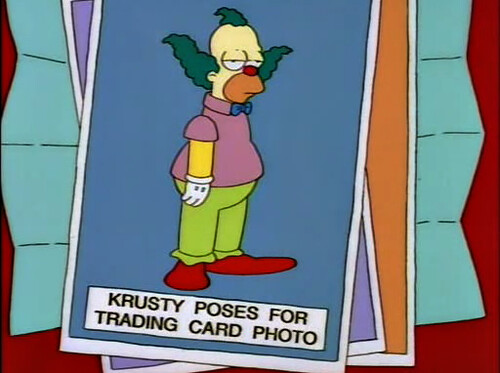
No doubt because of the heavy Sky presence throughout the rest of the collection, Merlin saw fit to include a double page spread on the channel's television coverage in the centre of the album. Entitled "Fabulous Footballing Facts About Sky", the section contained six stickers ranging in excitement from a Sky Sports logo that at least counted as a shiny to the mundanity of a cameraman standing pitchside. In another shot, Clive Allen - still on West Ham's books that season - is pictured sitting next to Richard Keys, who sports a jacket so yellow even the cast of Hi-de-Hi! would've dismissed it as garish. Stickers such as this, and the one of original Goals on Sunday presenters Anna Walker and John Solako posing for the camera, were obliged to be collected even if they were the football equivalent of the "Krusty Poses for Trading Card Photo" gag in The Simpsons.
The album ends on a rather poignant note, picking out eight players for its "Rising Stars" section. Some of those selected went on to enjoy respectable top flight careers but none of them became the superstars that the makers of the collection clearly thought they could be. Steve Froggatt, then a spritely winger at Aston Villa, eventually received an England call-up in 1999 while at Coventry, as did Norwich starlet Darren Eadie in 1997, but neither received a cap and both retired early due to injury. Chelsea youngster Neil Shipperley went on to play professionally until 2007 but never got further than seven U21 appearances. Southampton's Neal Bartlett and Manchester City's Adie Mike, however, had both dropped into Non League football within five years.
Looking back at the 1993/94 season through the medium of stickers offers an intriguing glimpse at the brief period between the formation of the Premier League and Euro 96 when the infiltration of television money and glamour hadn't quite taken full effect yet. Newcastle and Blackburn had both won promotion as a result of wealthy benefactors but Sir John Hall and Jack Walker remained examples of the traditional model in British football of the dominant businessman in the area taking control of his local club. The baggy indie fringes modelled by the likes of Manchester City's Garry Flitcroft and Sheffield Wednesday's Graham Hyde, meanwhile, come across as fairly budget concessions to style next to the sleeve tattoos and bejewelled earrings that would be flashed across our screens in later years.
Our thanks goes to William for this trip down memory lane. If you'd like to share any memories on football nostalgia, drop us a line at admin [at] thefootballattic [dot] com...
Perhaps we've said it before, but we often find it all too easy to overlook the wonderful world of match-day programmes here at The Football Attic, and for that we can only apologise. Few things provide a lasting, tangible snapshot of the football world like the humble programme, let alone its undoubted ability to liven up the most miserable of visits to watch the team of your choice.
So let's celebrate the match-day programme and, more specifically, the work of the graphic designers and printers that created so many wonderful and memorable covers.
In this feature, we'll pick a club at random, then choose our favourite programme cover design from each of the last six decades for that club. We'll explain why we like our choices and invite you to give us your choices too, but that's all we're doing - simply admiring the artwork.
So as if to suggest an alphabetical approach to all this, let's begin with the match-day programmes of Arsenal...
Arsenal programme, 1968-71
The 1960's
I love this design. The first thing you notice about it is the big white circle (a ball, if you will) showing the match details and so on, but then you notice the red background which is actually a tinted selection of Arsenal-related photos. Finish the whole thing off with the club name running around the circle and you have a very nice eye-catching composition.
This cover was first seen during the 1968/69 season and, save for a different selection of background pictures, continued right through to 1970/71. As a bridge between the 1960's and the 1970's, this worked really well as it didn't use a typeface or imagery that associated itself with one decade or the other. Nice work.
Arsenal programme, 1975-76
The 1970's
Though it only lasted for one season, this was my favourite Arsenal programme design of the 1970's. The contrast between black-and-white action shot and plain red upper section is dramatic and works really well, while the seriffed header font is dignified and clear.
The two stripes look good too, although it is a little misleading in making you think that the stripes featured on Arsenal's kit somewhere. As all you kit aficionados will know, Arsenal's kit remained constant right the way through the 1970's and certainly didn't have anything as garish as a double stripe anywhere on it.
In summary, then, this wasn't the most eye-catching design from the decade, but it was smart and reflected the end of the post-glam era in a suitably understated way.
Arsenal programme, 1981-83
The 1980's
If any decade is guilty of fashion crimes, it's the 1980's, and some of Arsenal's programmes at this time simply look a bit too 80's, frankly. This one, on the other hand, looks cool and vibrant.
Thanks to the introduction of full colour printing only a few years earlier, this programme design uses a photo from a recent match as the dominating element. No bad thing, either - it brings the excitement of the game sharply into focus. With a modern headline font that's not too quirky and all the important details down near the bottom, everything's neatly compartmentalised and easy on the eye. What's not to like?
Arsenal programme, 1998-99
The 1990's
To be honest, it's unclear what the background is on this cover. It's a sort of navy blue/burgundy/gunmetal mish-mash of a pattern, and yet it's not really important in the grand scheme of things. What's important is that it provides an interesting backdrop to the action photo that appears on top of it.
It's also a great contrast to the very nice gold 'Arsenal' lettering that features near the bottom of the cover. The lettering itself is taken straight from the club badge of that era, and it would subsequently be coloured silver on the official programmes during the following three seasons.
The fact that it was coloured gold here might have something to do with the fact that this was the season after The Gunners had won the League and FA Cup double. Further proof of that incredible achievement can be found in the trophy images that appear in both of the bottom corners. To complete the ensemble, a computer-style typeface indicates the match details and price (by now a whopping £2). Money well spent, however, given the lavish production values of this late-20th Century design.
Arsenal programme, 2008-09
The 2000's
Fast-forward ten years and you find all the intricate detail stripped away to leave a very nice, simple, clean composition. By this stage, Arsenal had updated their badge (which now appeared in the top-right hand corner) and the typeface from it was used, as before, for the main title.
The ever-present match photo filled the full width here and would have taken up the full height too were it not for the red bar across the bottom. If you can pick out any negative from this design, it's the fact that the commercial age was now demanding three corporate logos be displayed - one each for Emirates, Nike and the Barclays Premier League - but at least they were tucked away nice and small in the bottom-left corner where they wouldn't be too distracting.
In many ways, this is as neat and stylish as you could ever ask for... but when the second decade of the 21st Century arrived, it was all change again...
The 2010's
OK, so the decade is still in progress and has barely started, but out of the four seasons that have begun up to now, this design is the pick of what we've seen so far.
Looking more like a brochure than a programme, there was now a thick white border around the front cover providing a pleasant contrast from the colour overload of previous efforts. There was also no mistaking the title of the programme as it was now appearing top-left, as is somewhat traditional for magazines of all kinds.
A squat sans-serif font displays the match details in an unambiguous fashion, including a four point bullet strap below the main title. Then there's those all-important logos which have been parked neatly along the bottom edge - perhaps the result of some over-clinical styling. At least you can't argue with the clarity of detail on the cover, and it's interesting to note that this season's design takes this concept and gives it a more complicated appearance. Bit of a shame that...
Anyway, there it is - our choice of the best Arsenal programmes from six decades. We'd be interested to hear your views about which ones you like or dislike, and as ever we invite you to leave us a comment below or contact us via Twitter, Facebook or via email at admin [at] thefootballattic [dot] com.
I love the World Cup..who doesn't? Well, Sepp Blatter's trying his best to ruin it, but then that's pretty much what he always has done...allegedly, said Rich, unaware that it's not actually still the 90s er...not! Ha!
Anyway, every World Cup brings highs and lows...more of the latter if you're from these lands, but here I shall give you my own personal top 5 moments from the 3 tournaments that took place in the 90s. Take note, these are not just the best goals or most famous incidents, this is my personal selection of memories from Italia 90, USA 94 and France 98 so yes, John Aldridge kicking off against Mexico may have been funny, but it's been played out so often now, it's just no longer that special.
Enjoy!
1. 1990 - Costa Rica V Scotland - Geovanny Jara's Backheel
Look everyone, it's Scotland at the World Cup...Yeah I know I've done joke before, but it's still funny! OK, so maybe not to everyone... Anyway, let's revisit the glory days when they used to get to Round 2...wait, what? They never did? Ooooooooh....
But seriously, back in 1990, it was quite common for Scotland to be at the World Cup and it was only 12 years prior when those north of the border jetted off to Argentina while those 'back home' sat and watched Archie Gemmill tear Holland a new one.
Their opening match of Italia 90 came against a side with no great expectations and so in the sunshine in Genoa, Scotland, in their garish change strip, looked for a positive start. 4 minutes after the interval, that positivity was looking shakey.
Hector Marchena made a diagonal run before playing in the protagonist, defender Geovanny Jara. In the box, close to the penalty spot, it appeared Jara would turn and shoot, but no. Instead, he immediately rolled the ball into the open space directly behind him, allowing the incoming Juan Arnaldo Cayasso to carefully place the ball past the closing Jim Leighton. Costa Rica continued to defend resolutely and held on, Scotland unable to break through for an equaliser.
Ultimately, this early defeat cost them dear as they ended up exiting at the group stage once more as Costa Rica beat the group's whipping boys Sweden while Scotland lost to a single goal against Brazil in what was a much closer contest than the result could ever suggest.
For me, this just epitomised Scotland's World Cup campaigns. A combination of losing games they should have won, conceding a quirky goal and a brave, ultimately futile performance against a better side.
2. 1994 - Yordan Letchkov's header V Germany
One team who are always at the World Cup, and almost always in the final are Germany. Coming into USA 94 as title holders, they started off in their usual fashion...never looking brilliant, but somehow managing to progress. A lacklustre 1-0 victory over Bolivia in the opening match was followed by a stalemate against Spain. In their final group match, they were 3-0 up against South Korea before almost collapsing as Korea pulled 2 goals back, as they had done against Spain.
A jittery second round tie against Belgium saw yet another late scare and another 3-2 scoreline, which meant they would face Bulgaria in the quarters. While Bulgaria will be remembered as one of the best teams at this tournament, Stoichkov going on to share the Golden Boot with Russia's Oleg Salenko, the fact they were in the quarter finals was quite jammy. Opening the tournament with a 3-0 thrashing from Nigeria, they then dished out their own hiding against Greece...but then again, everyone was doing that. They booked their place after defeating a freshly Maradona-less and already qualified Argentina in the final group match and a penalty shoutout win over Mexico in the 2nd round.
Despite the Germans' shaky start, no-one really expected anything other than yet another semi-final appearance for Deutschland and sure enough, a 47th minute Matthäus penalty put them in the lead. Germany's failure to score a second seemed incidental until a fantastic Stoichkov free kick gave the Bulgarians a sniff of history-making. 3 minutes later, a cross makes its way into the German box. Letchkov escapes his marker and dives for the ball, sending it past the helpless Ilgner. Letchkov's celebration would suggest not even he thought it was going to work, but work it did and the nation of Bulgaria (and pretty much every other nation outside Germany) leaped to their feet with him as they looked forward to the first World Cup semi final without Germany since 1950!
3. 1990 - Maradona Cracks Brazil Open
Like a nut...a Brazil nut...see!
Despite ultimately reaching the final, Argentina were a shadow of the team that had taken the trophy 4 years earlier in Mexico. Adorned in a rather dated looking Adidas kit, they'd lost their opening match to the totally unfancied Cameroon (an obvious Top 5 moment being Massing's attempted murder of Caniggia), beaten USSR thanks to another piece of Maradona handiwork and drawn with Romania, leaving them in 3rd place and scraping into Round 2.
There they faced Brazil, who conversely had won all of their group matches and were favourites for this all South American tie. A rather turgid game saw relatively few chances, when, with only 10 minutes left, Maradona, in a rare flash of his 86 best, rode several tackles on a run to the edge of the box, before threading a beautiful pass through to Caniggia, who made no mistake in ending the Brazilian dream once more.
Argentina would go on to drain the life out of the remainder of the tournament, playing for penalties in the 1/4 and semi finals, before ironically being defeated from the spot in the Final. Maradona may have ended the tournament in tears, but moments like these just confirmed what could have been.
4. 1990 - ITV Opening Titles & The San Siro!
Ah Italia 90! My first proper World Cup. Home from school on a friday, I sat down to watch the opening match and my mind was about to be blown!
Firstly, Rod Argent's awesome theme tune, Tutti Al Mundo burst onto my screen and I was in love. Cod opera, stirring synth strings and orchestra stabs accompanied bouncing footballs on a map of Italy, all in lovely red, white and green computer graphics. Hello the 90s!
Once the theme tune was over, I was barely recovered when this hoved into view.
This was in the pre-internet days when photos of foreign stadia were like gold dust and the only hint I'd had of what this would look like was my Merlin World Cup 90 sticker album, which only showed it mid construction. The behemoth that is the San Siro remains to this day the ground that has most bowled me over and set off an unhealthy obsession with football grounds that has remained with me ever since. Just look at it! Giant girders, endless spirals, pure brutalist / modernist architecture at its finest. Even now, 23 years later, it still makes me gaze in awe.
Typically, Blogger can't find the youtube clip that exists of the opening titles so it's here instead!
5. 1998 Dennis Bergkamp! Dennis Bergkamp!
This is my favourite memory from 1998, not because of the goal itself (I wanted Argentina to win), but for the Dutch commentary that accompanies it. Obviously, this is a retrospective memory as I wasn't watching this in Holland at the time, but who cares? It's still the 2nd best piece of commentary ever, after the excellence of Bryon Butler for Maradona's 'goal of the Century'.
I'll say nothing more about this...just sit back and enjoy the perfect combination of a sublime goal and raw emotion.
My mate Martin and his older brother Darren loved video games and video game consoles. The spare room in their house was like an Aladdin's Cave of computer-based entertainment, and I loved paying them a visit every weekend just to wallow in the splendour of it all.
Their shelves were packed with title after title - good, bad and downright peculiar - and yet strangely only one in particular has stuck in my mind after more than 25 years: World Soccer for the Sega Master System.
There's no reason why it remains so memorable with me other than the fact that the cartridge case was often displayed front-on rather than showing only the spine.
That minimalist cover with the grid and a cartoon-style leg obviously had enduring qualities in the way no manufacturer would dare emulate nowadays. I don't even remember playing the game either, although it's entirely possible that I did. Certainly the evidence that YouTube provides has stirred one or two long-dormant memories in the back of my mind.
So what about the game itself? Essentially this was arcade fare - bright, zingy colours, low resolution and squeaky synthesised music, but par for the course back in 1987. On boot-up, a cheery title screen preceded the playing options which offered the choice of either a regular game of football or a penalty shoot-out competition.
Choosing the former prompted a further screen in which you chose the nationality of your own team and that of your opponent. There were eight countries to choose from covering a wide range of credibility, depending on your viewpoint. Alongside the international heavyweights of Brazil, France, Italy, Argentina and West Germany were the USA and Japan (neither of whom had made any real impact on the World Cup at that point) and Great Britain, a team that didn't actually exist in football terms.
No matter. By selecting the two countries desired, you were treated to a Casio-keyboard rendition of the anthems for both - a nice touch, and one that certainly showed the attention to detail that the team strips lacked. West Germany in yellow shirts?
With the teams picked, it was on with the action as the two sets of six small players ran onto the pitch. The roar of the crowd was as confusing as it was loud. If you've ever held a rolled up newspaper to your ear and listened to a toilet flushing, you'll probably get fairly close to the sound that greeted the teams' arrival.
Once the game was under way, the players scurried around in an appealing fashion, chasing a nicely animated ball that give a simple depiction of rotation and movement. Unfortunately the bounce of the ball was so minimal that you'd have been forgiven for thinking it was filled with concrete. On the positive side, however, it was unlikely you'd have kicked the ball into touch, no matter how hard you'd kicked it.
Unlike the games of today, there weren't many special moves that the players could make other than dribbling, passing, shooting and slide tackling, but there was the possibility of executing an overhead kick in front of goal if you'd timed it right and if you were optimistic enough to think you could score from it.
If you did score, however, the crowd went wild!
(Sorry - 'a bunch of kaleidoscopic ants behind the goal did the lambada.' Well, it amounted to the same thing, really.)
You'd also get to see a digital scoreboard showing the current tallies for both sides, and just as well because the score didn't appear permanently on-screen during the match. The provision of double figures to display both teams' scores was rather redundant too, as the close interplay on the pitch was hardly likely to see one team score ten or more.
Upon completion of a game, there was a lovely little sequence showing a member of the winning team joyfully holding the World Cup trophy aloft while one of the losing team walked up to offer a gentlemanly handshake.
Drawn games were decided by a penalty shoot-out competition, but if you couldn't engineer the score to suit your needs, you could also play the penalties in isolation via the main menu screen. The same setup applied - pick two teams, enjoy the national anthems for as long as you could stand them, then try to plant the ball past the opposition goalkeeper more times than they did it to you.
In this instance we saw the players in all their full-size glory as you controlled either the kick taker or the goalkeeper. Again there was some nice (if basic) animation sequences in which the kicker was seen either sinking to his knees when his shot didn't go in or elatedly doing star jumps when they did.
And that was about it, really. All in all, World Soccer offered simple, easy fun. It wasn't perfect, that's for sure; the pace of the game could've been a little quicker and the ball ought to have rolled and bounced more than it did, but the graphics were vivid and the game was easy to play.
We therefore doff our hat to the imperfect qualities of World Soccer - a good arcade football game that used its charm to win you over in the end.
There I was all set to create a Top 5 Kits article today and then I received this storming selection from James Campbell Taylor of the excellent site JCT. So sit back and enjoy a feast of kit loveliness!
Italy 1990
This kit will always be special for me, not least because it was the first I ever owned. What's remarkable is that it was the same shirt Italy had worn at the previous World Cup! The only difference that I know of (apart from variations of material based on climate) was that the red and green trim on the collar and cuffs was inverted, with red on the outside. But imagine a World Cup host today not cashing in on the occasion with a brand new kit! Unthinkable. In fact, the Italy shirt barely changed from '81-'91. Purists may opt for the cotton Le Coq Sportif version worn by Bearzot's triumphant '82 side (and it's hard to argue when I think of that Tardelli goal), but for me the "MADE IN ITALY" Diadora shirts were a more stylish fit worthy of the country they represented. This was the last major tournament before names and front numbers appeared on shirts, and the kit has a pure perfection for me. This was also before the FIGC allowed the manufacturer's logo to appear on the kit, a rule that was sadly lifted in 1999. The Azzurri had an excellent team that year too, and trooped out onto the Olimpico turf in dashing tracksuit tops (still trying to get one of these). As perhaps for many people my age, the summer of 1990 was a massive turning point for me in my appreciation of the game and all those other things that come along with it. In Italy they still refer to those World Cup matches as "notti magiche" after the official song of Italia '90.
Brasil 1986
Ironically when I bought my Italy kit in 1990 I'd actually had the intention of buying this shirt, only to find it had been replaced by the '90 version, of which I wasn't quite such a fan. Nineteen years later I finally got my hands on one through an ebay seller located in Malaysia. Sounds fishy, but I know a 100% genuine Topper jersey when I see one. Oddly I think Topper is actually an Argentine company. Like Italy in the same period, the Brazil kit saw minimal changes between '82 and '90, but '86 was always my favourite (although the '82 version could easily be number 3 on this list). Cool badge with the Jules Rimet trophy, great sleek fit and classic numbers too. Even the goalie shirts were great, with "B R A S I L" across the chest. Most of all I love the thought behind the colours themselves. A proper, deep sunshine yellow that darkens with sweat (the shirt is a polyester-cotton blend), forest green trim and shorts a sort of Napoli blue (not royal!) with the little stripes. That's my most consistent gripe with the modern Brazil kits, the yellow is too sterile, the green is too light and the blue is too dark. It's as if Nike's palette doesn't extend beyond the default primary colours that come with whatever primitive computer program they use to design their shirts. Yellow + green + blue = done. So sad.
Argentina 1978
I could have easily gone with the '82 or '86 versions (the less-celebrated '82 kit is probably the nicest if I think about it) but I'm including the '78 version for, well, obvious reasons. This was the last the last World Cup before I was born and I'm not sure if it was the handlebar moustaches, cynical tactics or the political situation in Argentina at the time but no subsequent tournament has been quite as... badass. Amid the ticker tape the hosts wore a now-classic shirt, but this was back when football shirts simply were what they were. I doubt kids in Buenos Aires were salivating at the prospect of what Kempes & Co. would be wearing at El Monumental — they just wanted the team to win. The tight fit, short shorts, long-sleeves and debut of the classic AFA numbers in the second round have sort of made it the model against which all future Argentina shirts have to be compared (I think it's why I liked the long-sleeved techfit version in 2010 so much... man, would I love to own one of those).
Spain 1982
The thing that irritates me most about Spain's recent domination of major tournaments is how suddenly the world is overrun with Spain fans. Where were these people when la Roja used to be routinely knocked out in lacklustre fashion at the quarter-final stage? While the team was less successful, Spain's kits in the '80s were glorious. I used to love the blue shorts (a similar shade to Brazil's actually) and black socks. So cool. I have a hunch that the black socks were a design feature imposed by Franco, which is why they were phased out, but I've never found any hard evidence to support this claim. The navy & navy short-sock combo adopted in the nineties was fine, now more recently they've started wearing red socks. It's just all so... bland and predictable. It's ironic that as kits become more elaborate and detailed so every trace of teams' personalities is being watered down and stripped away. Anyway, going back to happier times: the Le Coq Sportif kits worn in '86 and '90 were lovely, but you cannot beat the Spain '82 kit. I'm sure this outfit would be more fondly remembered by kit lovers had the team not flopped so miserably.
Mexico 1986
I've always been a fan of the Mexico kit, but I'm not sure why. Just always well turned out I suppose, even in recent years (except '98, which isn't so recent now). In 2002 they had a slightly darker green, and the away kit (while not used) was a fantastic burgundy with navy shorts like in 1970. In 2006 they had a cool chevron device on the front (later adopted briefly by Man U unfortunately) and fancy numbers. In 1978 their kit was manufactured by Levi's! Crazy! But if I had to pick one I'd go with '86. While a fairly standard adidas template what elevates the shirt is the wholly unprecedented and totally unnecessary inclusion of the word "MEXICO" above the number (where the player's name would go today). Circa 2005 Nike (then Mexico's kit provider) re-released a "version" of this shirt. There are probably a couple of other reasons why I love this kit. Besides loving that tournament (the long grass, the bright light, the saturated colours) there is also Manuel Negrete's goal against Bulgaria. Or maybe it's because I always think of this song.
So there you have it. I deliberately stuck to kits from the modern era, those pre-1970 didn't really change enough and are obviously too perfect in their simplicity. But surprisingly my choices represent a golden span of a mere twelve years. What's most interesting is that I've included the host nation for all four World Cups from that period! Proof that the hosts are always well-dressed I suppose — although that sequence came to an abrupt end in 1994. The hardest part was separating my appreciation for the kit itself from fondness for the team or era... I could have easily included Italy '94 or Brasil '82, and I am still grappling internally with my inexplicable exclusion of France's '78, '82 and '86 kits. So apologies that these choices are a little safe and hardly obscure. Maybe I should do an alternate list — the B-sides, if you will.
As I was compiling this list I realised that a lot of my favourite international kits are from European Championships. I feel another top five list coming on...
Huge thanks to James for a fine selection there...if you'd like to choose your Top 5 World Cup Kits (or any other tournament for that matter), drop us a line and let us know to admin [at] thefootballattic [dot] com... More Top 5 World Cup Shirt lists as chosen by other people... Chris O Rich J Al Gordon Ed Carter Rich Nelson Steve Gabb
Greetings, friends, and welcome to what is sadly our last Retro Round-Up here on The Football Attic. We think you'll agree we've had a lot of fun and laffs since we started this feature six months ago and we've proven conclusively that football nostalgia is still alive and well out there on the World Wide Web. With that positive thought ringing in our ears, let's do it all one more time with a final look at this week's top retro football picks...
...Starting with a revelatory look at Carlos Valderrama's haircut before he was famous. He didn't always look like he'd just been electrocuted, as proven by Old School Panini...
...More 'Before they were famous' fun can be found on this latest selection of old football stickers, courtesy of Who Ate All The Pies...
Over at The Goldstone Wrap, Christopher Worrall shows how easy it is to get the autographs of all your favourite players - just draw pencil sketches of them all and send your picture off to them...
...In the week when Liverpool FC and the wider world of football commemorated what would have been Bill Shankly's 100th birthday, Got, Not Got remembers the charismatic genius from Glenbuck...
...There's no doubting the football-playing brilliance of Cyrille Regis, and here he is personally dismantling Swansea City back in 1981 on another super video from FootballGaffesGalore...
...and finally, we come to our eBay Buy of the Week - probably the best one we've ever had, too. It costs £19,000 but you'll never spend your pennies more wisely - it's this truly unbelievable collection of Subbuteo equipment. Enjoy...
What's it like going to a match? Is it any different from watching it on TV? Is not having Jonathan Pearce shouting crap down your audiohole a plus or a minus? (it's a plus!) Have you ever left a game early? Do you like a pie and some Bovril?
All these questions and more are (sort of) answered in the latest exciting* episode of The Football Attic Podcast!
Oh and it's episode 13...unlucky for some? You decide!
This blog site is now closed. We no longer write new articles for it.
If you are a third party wishing to write an article for The Football Attic in exchange for self-promotion, we politely decline all requests in light of the previous statement.


