
After over a year of planning, research, discussion, design and sheer hard work producing hundreds and thousands of words for your reading pleasure, we can now proudly reveal our Greatest Football Shirt Ever:
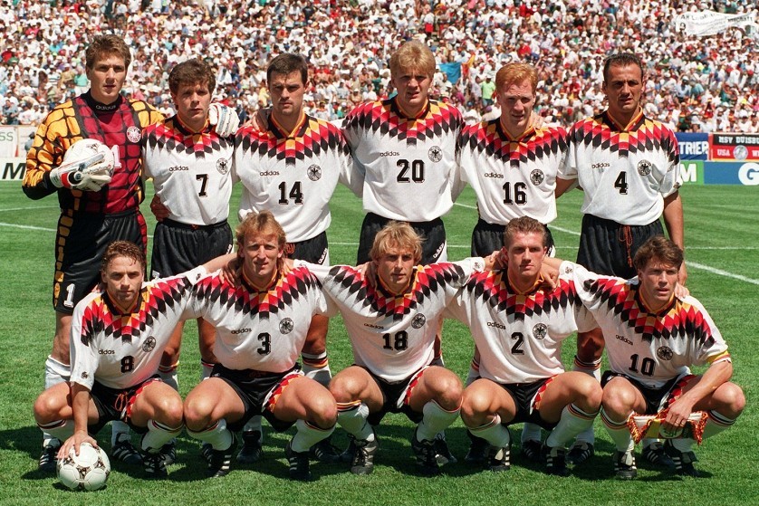
 |
| Click for larger version |
Often admired and beautifully executed, this was a shirt that opened our eyes as to what the future of football kit design could be like. Modern-looking, but not liable to get stuck in a time warp a year or two after its launch, this shirt quickly established itself as a classic in so many different ways.
To find out why, and to get some background on why we, the judging panel, placed it at the top of the pile, here are our thoughts on our Number 1 shirt...
[Rich:] I'm sure this may come as a surprise choice to many, but it's one of the few shirts we were all not only unanimous on being included, but also of its place at the top of the pile. While the template has already featured twice in this list, a fact which recognises the greatness of the design, this incarnation of it is head and shoulders above the rest for several reasons.
This shirt made its tournament debut at Euro 88, so it could so easily have been overshadowed by adidas's other offering, as sported by the Netherlands and the USSR, but while they were just the respective nations' colour applied to that particular template, this took the West German shirt to a whole new level. Prior to this landing, West Germany had never made much use of their other flag colours, red and yellow (black had been their standard trim for a long time). Their '86 shirt featured them as trim on the collar and cuffs, but it was so subtle, it was easy to miss from a distance. This, in stark contrast, was visible from space (possibly).
Given almost all of its predecessors - a precession of white shirts trimmed in black in the most staid fashion possible, the impact of this cannot be overstated! Suddenly, the usually straight laced Germans graced the pitch looking the epitome of style. The design was striking without being shocking, It just felt right - like something had been missing all these years.
The shirt cemented its classic status two years later when it was worn as West Germany lifted the World Cup for the very last time as a divided nation. That this shirt lasted not only a lengthy four years, but also continued as the unified nation's home shirt for a year further adds to its iconic status.
Sadly, in typical kit world fashion, the beautiful chest stripes, like the Berlin Wall itself, eventually fell away with their 1992 kit being a shadow of its former self. And then 1994 happened... but not even that can topple this as the Greatest Football Shirt Ever!
[Chris:] As a football kit manufacturer, you have to be very clever indeed to not just create a decent outfit for a team, but also a motif that stands out almost as a brand in its own right. That's effectively what adidas did with their 'ribbon' design which is undoubtedly the stand-out feature of this classic shirt.
So brilliantly original were those three undulating stripes in the colour of the German flag that no other manufacturer could hope to come up with anything remotely similar. If they had, they'd have immediately been accused of mimicking West Germany's 'ribbon'.
Take the ribbon away, however, and you're left with a very simple shirt indeed. First of all, it has a plain, round wrap-over neck that looks perfect (can you imagine this shirt with a v-neck?), plus the ubiquitous adidas stripes in black that are truncated nicely by the ribbon.
Other than the DFB badge and the old adidas logo (pushed higher up the shirt but to no overall detriment), that's it. No contrasting black trim on the cuffs, no intricate shadow patterns... no nothing... and it's all the better off for it.
As Rich said, this shirt design was another that raised the bar in quality and looked cool - uber cool. Interestingly though, where France's great Euro 84 shirt has been recreated and reinvented as a tribute down the years, this one belonging to (West) Germany has not. Out of sheer reverence, perhaps? Why not. It really is in a class of its own and deserves to be held up as a shining example of superb football shirt design.
[John:] Apart from integrating the German national flag into a kit design - a design tactic that at the time was still relatively scarce - the strength of this shirt for me is its pure aesthetic quality. It just looks so damn good.
Of course by the very nature of the German national identity colour scheme and the fact that they have a nice white canvas on which to present them, they do have a considerable advantage. Still, adidas's execution of these various elements is simply exquisite (incidentally what was in the water at adidas's design headquarters in the '80s?! So many great designs!)
The shirt was brazen, bold and confident - a real move on from the country's traditional plain white shirts and a style that still clearly influences kits to this day.
The design was so perfectly suited to the German flag, it makes you wonder now if this masterful triple layered decoration was created originally for Germany and then rolled out throughout the adidas roster? If so, it was a shame that this triple layered colour block motif didn't make it to any British shirts, except for the odd tracksuit.
[Jay:] As we salivate at the thought of British clubs wearing the design element from the '88-91 West Germany shirt, it should be remembered that whilst its application on adidas tracksuits in 1989-90 was a less satisfying spinoff, it's one which enabled it to claim a remarkable treble of English league title (Liverpool), FA Cup (Manchester United) and World Cup (West Germany) that season. And popping up on Michael Knighton's sweatshirt as he jogged around Old Trafford doing keepy-up is an added bonus.
And from such inauspicious beginnings. Worn in the German-hosted Euro 88 tournament, Ronald Koeman treated the design with utter contempt when he - yes - mimed wiping his backside with it in the wake of the Netherlands' victory over their traditional rivals in their own back yard. At that point, that famous 'ribbon' could have been consigned to the dustbin of football kit history, but the Germans - Die Mannschaft and adidas both - elected to persevere with the creation.
We are eternally grateful that they did. I argued hard that the derivative fleeting Away version was included in this collection, and the Cork City descendant too, but I honestly could have made a case for a Boca Juniors Away shirt also qualifying, and a lost Ireland shirt too. Perhaps the discombobulating Ennere Atalanta and Napoli bastardising would have been pushing my luck, but our no.1 shirt's influence is truly staggering.
But this isn't about, primarily, influence; it's about a football shirt being great, on impact and aesthetic levels. This shirt was groundbreakingly striking and has endured. It was also an early retail success story, with several versions (permutations were minor and related to manufacturing techniques) in long- and short-sleeved selling by the bucketload, along with mimicking t-shirts, tracksuits, jackets and travel bags.
Yes, that ribbon, on the famous white of Germany, teamed with the national pride of World Cup glory and unification, was embraced wholeheartedly. It gave us a great shirt. The greatest.
And that, ladies and gentlemen, is it. Our compilation of the 50 Greatest Football Shirts Ever is complete. The full list can be viewed here, so all that's left is to thank each and every one of you that's left us a comment on our website, Facebook and Twitter throughout. We really enjoyed hearing your thoughts and opinions on the fifty shirts featured, and we hope the series managed to entertain, enlighten or inform - even if our selections didn't match up with your own!
Finally, our grateful thanks also go to Jay from DesignFootball.com and John Devlin from TrueColoursFootballKits.com, both of whom provided us with all the support, insight, humour and, in John's case, superb illustrations we could ever have asked for! Without them, we simply couldn't have created the 50 Greatest Football Shirts Ever to the standards you've seen.
Their contributions, and yours, have made this a truly great project, and we hope you've enjoyed it at as much as we have. Cheers!
Chris and Rich


It had to be this. Head and shoulders the best shirt of all time.
ReplyDeleteAnd you were indeed right Nick :)
DeleteWhat I always refer to as the Three Lines on the shirt :-)
ReplyDeleteHeh... fabulous! :)
DeleteThe perfect finish to a great project! One of my favourite DFB shirts of all time, and one that has never gone out of fashion - and never will.
ReplyDeleteThanks very much, Rick. It's hard to imagine this shirt EVER going out of fashion... :)
DeleteSome of the choices may have come in for criticism - from this quarter included - but I have no quibble at all with this and the widespread agreement shows that it is the right choice. Not shirt-related but the plain black shorts added to the classiness of the kit IMO
ReplyDeleteAn absolute design classic. They should have one in the Museum of Modern Art in New York, if they don't already.
ReplyDeleteA true classic, hopefully I'll get my hands on one of these one day
ReplyDelete