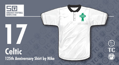
So, 25 years later and with the next major milestone looming, what to do? The world had changed and with special edition shirts being released almost every day celebrating such mundane things as when some bloke off a student's t-shirt dropped by your place 50 years ago, the big question was how to mark the occasion?
Celtic's answer? Create one of the classiest special edition shirts ever!
 |
| Click for larger version |
The shirt itself was all white, topped off with a small, black collar so we're starting with a minimalist cool look already, but what really makes this shirt special are two subtle details. As with the 87/88 shirt, they changed their badge to their original Celtic cross, albeit in updated form, but it's what's beneath the crest that tops this shirt off nicely.
Sponsors logos are a touchy subject on shirts these days, so when it comes to an anniversary edition, how would such a classy, retro looking shirt look with 'Tennents' sprawled across it?
This problem was solved beautifully by the lager manufacturer allowing their logo to be rendered in white, subtly outlined in grey, and in a small version, just below the badge. This was a classy move by Tennents, which showed smart thinking. They didn't ruin the shirt and would no doubt have won people over by not doing so, Nike followed suit and the swoosh also appeared in white, leaving what appeared to be a retro-styled shirt bereft of logos of any kind. I don't think there's been a classier anniversary shirt.
As a side note, Rangers, themselves sponsored by Tennents, also had the sponsor logo in the same size and placing, so as not to create any imbalance across the divide.
Written by Rich Johnson (The Football Attic).
This shirt is part of The 50 Greatest Football Shirts Ever. The full list can be viewed here.


only shame is they didn't have a goalkeeper kit that matched the kit
ReplyDeleteI love this one and it's on my wish list. Just did a recent post on it: http://wp.me/p1HotG-SK. Keep up the great work.
ReplyDeleteGreat article, Austin! Thanks for your kind words... :)
Delete