
As usual when Chris posts a Top 5, my immediate reaction is to grab onto his coat tails and quickly chuck my own top 5 out there, but in the case of his Top 5 England Home Kits, he's chosen some crackers and 2 of my would-be top 5 are also in there.
At some point, I will choose my Top 5 2nd/3rd kits, but for now, I'm going in the opposite direction and bang out what I think are the Top 5 worst England home kits.
In no particular order...
 1. Umbro 2003-2005
Famous for: Penalty woe... again
Worn in England's disappointing (do we ever have any other kind of tournament these days?) Euro 2004 campaign, this kit conjures up images of surrendered leads and yet another penalty shoot-out defeat. The reason I dislike this kit however is the sheer banality of it.
When dealing with minimal designs, there's a fine line between 'classic' (see 2010) and bland. This sits on the latter's side. What could have been a great kit with clean lines and a strong red shoulder stripe is rendered boring by lame horizontal shadow patterning and a tiny tiny England badge. Instead of appearing bold, it appears apologetic. Apology not accepted!
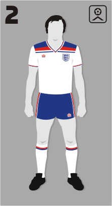
Famous for: Keegan's flick...
I know this is going to be controversial (it's one of Chris' favourites!), but I really, REALLY don't like this kit and never have. To me it represents Admiral's fall from grace, going from a range of classy kits to this overblown, garish slice of early 80's awfulness.
The V-neck was too large and dates it badly, but the real crime is those huge panels. As with the classic / bland line, there's a fine line between daring and hideous. This is so far over that line, you'd need the Hubble telescope to see it.
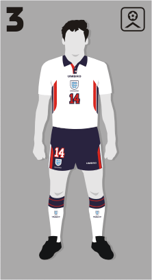
Famous for: "Quickly Kevin, do you think he'll score?". "Yes!...oh..."
Large panels again! Worn in one of England's most exciting World Cup matches in modern history, the 2nd Round draw against Argentina, which featured the following:
- Argentina taking an early lead from a penalty
- Owen diving for the equalising penalty
- Owen staying on his feet and scoring a goal that still makes my skin tingle
- Argentina equalising with a brilliantly worked free kick
- Beckham's sending off.
- Alan "Elbows" Shearer ruining a perfectly good goal from Campbell.
- David Batty missing his penalty.
Unfortunately, it also featured this mess of a shirt. I was never a huge fan of the Euro 96 kit (turquoise?), but this replacement was crap. Three lions? Where? Oh that really faint bunch of tiny cats in light blue, floating around in a giant shield? NO!

Famous for: "Do I Not Like That!"
England's Italia 90 kit has unsurprisingly gone down as an all time classic. I don't personally think it's one of the best designs out there, but it's still pretty good. Shame it was sullied slightly by featuring at Euro 92...worn by Carlton Palmer and Andy Sinton...
But time moves on and so it was that England's brilliant qualifying campaign for USA 94 was undertaken in this smart outfit. By which I mean we failed to qualify for the World Cup wearing one of the lamest shirts ever! The first badge to see the 3 lions lost inside the shield (a la 97-99), at least they were visible... but then even if you didn't see them, it was OK as a second mini badge adorned the neck. Because that's what you need on a national shirt... two badges! Mummy badge and baby badge... awww how cute is that? It isn't! We were crap and had a shirt to go with it.

Famous for: Absolutely nothing!
Remember this kit at Euro 2008? No! Why not? We all know!
Yes, I hereby give you a kit overshadowed by a bloke with a brolly. But that's not why I dislike this outift. I dislike this one because it marked the pinnacle (nadir?) of adding unnecessary bits of "design" onto the kit. The red stripe was cool, the pointy flag on the shoulder was interesting, if a little tacky. This on the other hand was just shit. A red stripe with erectile dysfunction draped forlornly across the shoulder for no discernible reason, topped off with two blue diamonds... because...?
It was also the last kit to feature the detestable and wholly superfluous 'ENGLAND' wording on the badge.
Thankfully, someone at Umbro stepped in after this and came up with the 2010 classic outfit and it's been pretty good ever since... yes, even the Peter Saville one with the multicoloured crosses on it is better than any here! Can't wait for Nike to ruin their good work though ;-)


On the 2007-2009 kit, the 2 blue diamonds are viagra, thus continuing the erectile dysfunction theme.
ReplyDelete