
Actually, they're needed back in modern football with all of the ingenuity, creativity and boldness they possessed back in the 1970's. Is that too much to ask? It's just that today's football kits often have an air of bland conformity, designed with one thing in mind - to offend as few people as possible. At least that's my view.
Admiral knew the time was right to shake British football out of its design coma four decades ago. What it brought to the table was a reinvention of the way football teams looked out on the pitch and the way fans looked away from the match.
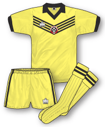
One miraculous example was the kit they provided for West Ham United at the start of the 1976-77 season, and the shirt that provided the most eye-catching element of it. In short, it featured chevrons; four thin claret-coloured v-shaped lines on a v-shaped light blue yolk covering the upper body. There's little anecdotal evidence as to the effect this new shirt created 39 years ago, but by all estimations, it must have been huge.
 |
| Click for larger version |
Like so many of Admiral's football shirt designs of the Seventies, this one had a distinction that had rarely been seen before. No other team had worn anything like it (the closest being a large 'V', perhaps), and few other teams wore the same template at the time. Only Sheffield United followed suit by adopting the Admiral chevrons between 1977 and 1979, and even then it was without the aid of the upper body panel in a contrasting colour.
With beautifully styled stripes on the cuffs and the fashionably large collar, this shirt dared to not only give West Ham their traditional light blue sleeves but also light blue on much of the shirt too. Such a change in balance in the use of club colours on a shirt can cause discontent among fans. It's happened on a number of occasions in recent years, but back in the late-1970's there were plenty of West Ham supporters that were only too pleased to see an injection of fashion livening up their team's kit. I count myself as one of them.
But let's go back to those chevrons. Pretty groovy, weren't they? And you may be wondering why they weren't seen more often back in the day. Well in many ways, they were - but not on the team shirts.
Instead, you'll have to look at some of the tracksuits Admiral were making for teams all those years ago. The evidence is there for all to see, whether it be at the 1976 FA Cup Final, Wales playing Yugoslavia in the same year, or just John Bond getting his official team photo taken at Carrow Road. Whatever the colour combinations, those chevrons looked sensational, but only West Ham wore them proudly on a regular basis out on the pitch.
And what was that opening line - "we need them back in modern football where they used to be"? Well beyond the radar of most people's awareness, Admiral are taking steps to do just that. Over in the United States, one team, the Charlotte Eagles, launched their new Admiral kit a few years ago, and it had a familiar look. There, in simplified form, were some chevrons in orange, white and black. Reworked for 2012, it proved that Admiral still had an eye for great design but hadn't forgotten their rich heritage.
Amen to that, and all power to them, say I.
Written by Chris Oakley (The Football Attic).
This shirt is part of The 50 Greatest Football Shirts Ever. The full list can be viewed here.


You can still make this kit and countless other old admiral templates on their teamwear site: http://admiral.axissoccer.com/mycolors/
ReplyDeleteCool... :)
DeleteA 'rather natty cowboy jersey' as my old Nan said.
ReplyDeleteLol... Never heard it described like that before!
Delete"Such a change in balance in the use of club colours on a shirt can cause discontent among fans."
ReplyDeleteTry being a Sheffield United fan who supports this season's butcher stripe anniversary kit.
Speaking of Admiral, while they're not supplying kit for many clubs now, they make brand-name-at-a-budget leisurewear. My local Sainsburys just got some Admiral polo shirts in and there are also tracksuits in the range (but not of the chevron variety). Some might call me a chav for wearing Sainsburys clothes but I love Admiral and always will.
We share your pain, Anonymous... The new Sheffield United kit looks great - if you take away the United connotations - but I think I'd be frustrated to see it if I supported The Blades.
DeleteGreat to see Admiral still making stuff, regardless of who's selling it! Stand proud, comrade... :)
I thought Admiral's return with Leeds in 1992 was quite the thing - in an era where baggy complicated shirts were the norm, they produced a striking all white kit with a simple v-neck collar. http://www.leedsunitedmatchworn.co.uk/wp-content/uploads/2012/11/55250684-1251952138-eric-cantona.jpg
ReplyDeleteUnfortunately their long term contract was cancelled after one year and Leeds didn't get a comparably smart kit until Nike took over.
The picture in your link is not Wales V Yugoslavia. That match was played in the afternoon at Ninian Park, Cardiff. The ground in your photograph is the Racecourse Ground, Wrexham and the match is probably Wales V England, March 24th 1976, a Wednesday night. Sadly Wales lost 1-2.
ReplyDelete