Saturday, 11 July 2015

[50GFSE] #29 - West Ham United 1976-80 Home Shirt by Admiral

Somebody call Admiral. No, not the car insurance company. Somebody call the legendary football kit manufacturers of the same name. They're needed back in modern football where they used to be... BADLY.

Actually, they're needed back in modern football with all of the ingenuity, creativity and boldness they possessed back in the 1970's. Is that too much to ask? It's just that today's football kits often have an air of bland conformity, designed with one thing in mind - to offend as few people as possible. At least that's my view.

Admiral knew the time was right to shake British football out of its design coma four decades ago. What it brought to the table was a reinvention of the way football teams looked out on the pitch and the way fans looked away from the match.

Click for larger version
One miraculous example was the kit they provided for West Ham United at the start of the 1976-77 season, and the shirt that provided the most eye-catching element of it. In short, it featured chevrons; four thin claret-coloured v-shaped lines on a v-shaped light blue yolk covering the upper body. There's little anecdotal evidence as to the effect this new shirt created 39 years ago, but by all estimations, it must have been huge.

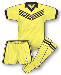
Like so many of Admiral's football shirt designs of the Seventies, this one had a distinction that had rarely been seen before. No other team had worn anything like it (the closest being a large 'V', perhaps), and few other teams wore the same template at the time. Only Sheffield United followed suit by adopting the Admiral chevrons between 1977 and 1979, and even then it was without the aid of the upper body panel in a contrasting colour.

With beautifully styled stripes on the cuffs and the fashionably large collar, this shirt dared to not only give West Ham their traditional light blue sleeves but also light blue on much of the shirt too. Such a change in balance in the use of club colours on a shirt can cause discontent among fans. It's happened on a number of occasions in recent years, but back in the late-1970's there were plenty of West Ham supporters that were only too pleased to see an injection of fashion livening up their team's kit. I count myself as one of them.

But let's go back to those chevrons. Pretty groovy, weren't they? And you may be wondering why they weren't seen more often back in the day. Well in many ways, they were - but not on the team shirts.

Instead, you'll have to look at some of the tracksuits Admiral were making for teams all those years ago. The evidence is there for all to see, whether it be at the 1976 FA Cup Final, Wales playing Yugoslavia in the same year, or just John Bond getting his official team photo taken at Carrow Road. Whatever the colour combinations, those chevrons looked sensational, but only West Ham wore them proudly on a regular basis out on the pitch.

And what was that opening line - "we need them back in modern football where they used to be"? Well beyond the radar of most people's awareness, Admiral are taking steps to do just that. Over in the United States, one team, the Charlotte Eagles, launched their new Admiral kit a few years ago, and it had a familiar look. There, in simplified form, were some chevrons in orange, white and black. Reworked for 2012, it proved that Admiral still had an eye for great design but hadn't forgotten their rich heritage.

Amen to that, and all power to them, say I.


Written by Chris Oakley (The Football Attic).

This shirt is part of The 50 Greatest Football Shirts Ever. The full list can be viewed here.

Friday, 10 July 2015

[50GFSE] #30 - Saint-Étienne 1981-82 Home Shirt by Le Coq Sportif

The iconic French side Saint-Etienne (pronounced ‘center gen’ as we are reliably informed by our resident Frenchman, Jay) have had so many sublime kits over the years its difficult to pinpoint just one to be elevated to greatness. The 70's classic with tricolore trim is just one example of how ‘Les Verts’ dominated French football fashion at the time. But for me the 1980-84 Le Coq Sportif long-sleeved home shirt is truly an item of apparel to be marvelled at.

Click for larger version
It's a jersey that is as confident, bold and stylish as the team that wore it (which of course included a young Michel Platini who helped the side clinch the 1980-81 Ligue 1 crown). You may remember the French 1980-84 adidas home shirt that made it into our countdown last week? This shirt is a close relative and features a similar collar/white insert panel combo; the white insert standing out like a beacon amidst a field of green. This shirt also features pinstripes, but in a sartorial statement that took us in England a good couple of years to catch up on, they were placed horizontally! And in pairs! And they continued on the collar! Incroyable!

As if that wasn't good enough the logo of club sponsors ‘Super Tele’ (a French pop/TV magazine) is frankly enormous and plastered over the shirt in an example of blatant and arrogant commercialism. To some it may be ugly, to me, its beautiful! France embraced the common sense of sponsorship early on and in fact, all French sponsors’ logos at the time were huge including that of KB Jardin who took over the shirt deal from Super Tele in 1981 and continued on this jersey until it was mothballed at the end of the 1983-84 season.

From a retro perspective there’s something about a massive ‘in your face’ sponsors logo that is inherently cool - and the fact that in this instance it's on arguably the coolest shirt of the coolest team in France is perfectly fitting.

Written by John Devlin, founder and illustrator of TrueColoursFootballKits.com.

John can be found on Twitter and True Colours is also on Facebook.

This shirt is part of The 50 Greatest Football Shirts Ever. The full list can be viewed here.

Thursday, 9 July 2015

The Football Attic Podcast 25 - 50GFSE 40-31

It's time for the second podcast in the Greatest Football Shirts Ever series and today we're covering shirts 40-31!

Prepare for nearly 2 (two) hours of kitchat, which is a bit like a KitKat, but with 40 fingers...er...

So grab a beer or a horlicks and settle in for nerd nirvana! Booyakasha!

Subscribe to The Football Attic Podcast on iTunes or download our podcast here.

[50GFSE] #32 & #31 - USA 1994 Home & Away Shirts by adidas

Some things in life are great, not so much vicariously, but because something else exists (also consequently great). For example, certain film trilogies - you can watch one of the series but you enjoy it, generally, with the knowledge of the two others and their content - Stan Laurel and Oliver Hardy - natch - and the careers of Blur and Oasis - both bands were bound for stardom but achieved greatness through dovetailing. Y’know what, the Holy Spirit wouldn’t be all that without the Father and the Son either.

Numbers 32 and 31 in our list demonstrate this principle. The two USA shirts worn at the USA '94 World Cup in the USA - what I'm getting at is "U-S-A! U-S-A!" - carry enormous merit in their own right, but it is as a pair, a tag team referencing the American national flag, that they nail it.

Click for larger version
It is perhaps incongruous that we place the Home shirt at number 32. Not only is this committing the traditionalists' cardinal sin of placing elevated importance on the change shirt rather than the ostensible first choice colours, but it also means we discuss Old Glory's stripes before its stars. In fact, the only benefit of this ordering is the agreeable flow of this article's title.

Because, yes, the USMNT Home shirt in 1994 was actually the wavy red and white striped example, and not the "denim" starred version worn in the United States' three group games. With the latter so notorious, not a lot of people know that, and herein lies a true injustice.

Constantly in its other half's shadow, like Victoria in relation to David Beckham, few people realise how refined and knowing the perceived lesser partner is. With subtly waved stripes suggesting the fluttering of the flag of the United States of America, and this theme echoed on the collar and cuffs which had been trimmed more conservatively on contemporary equivalents, this marvellous twist on a perennially obstinate habitué of kit styles - the immovable vertical stripes - would actually also have been a fabulous way to outfit CD Guadalajara (Chivas) of Mexico.

However, the fact that this shirt is my own personal favourite of the two is a moot point - and the minutiae of Chris, Rich, John and I's decision-making processes is not something I'll bore you with - as there's no "I" in "equally and mutually complementary dual component release football jerseys". The Home without the Away is not nothing - far from it - but the whole is greater than the sum of its parts.


The Away - that shirt - has been written about in great detail elsewhere, but suffice to say it is one of the most controversial shirts ever, certainly in purist circles*. The all-American denim stylings (in reality a sublimation effect on a shirt similarly densely textured to its Home collaborator) appalled many but continue to excite collectors and kit historians to this day. But its importance goes far beyond its '90s exuberance and Luddite-goading, as it carried the starred side of a very special coin.

Click for larger version
The famous "denim" shirt and the criminally underrated striped Home represented not just the US Soccer Federation, but also the American nation as it dealt with the pressure of entertaining - in every sense - and this inseparable duo were designed to inspire and tug at the heartstrings of the US public and get the rest of the world on board. The Away had the stars, the Home had the stripes, and together they waved over the land of the free and the home of the brave.

As adidas's partner, Fifa, took its showpiece tournament to a previously insufficiently tapped market, the German manufacturer made one last marketing statement - with several beneficiaries - before the USSF contract was taken over by Nike.

Two shirts, one mission. As far as football shirt design goes: mission accomplished.

*The purists really would have been up in arms had the shirt been paired with a denim-styled pair of shorts trialled in a game prior to the World Cup. Football wasn't ready for double denim on the pitch just yet and Home plain blue shorts and rich red Aways were used, and swapped, at the tournament proper.


Written by Jay, resident blogger on DesignFootball.com.

Jay can be found on Twitter and DesignFootball.com are on Facebook and Twitter.

This shirt is part of The 50 Greatest Football Shirts Ever. The full list can be viewed here.

Soccer Monthly (No. 1, September 1978)

"Produced by the same team as that behind the widely read weekly magazine SHOOT", Soccer Monthly aimed to provide some weightier reading matter for football fans of all ages. In reality, it was most fly over the heads of young readers or their older brothers, appealing mainly to their dads, in all probability. There was text - LOTS of text - to be read, and were it not for the free wallchart given away in issue 1, it's hard to imagine many young kids being excited by that prospect.

That's not to say there was a lack of effort being made by the writing staff, many of whom were 'top names' from Fleet Street. Every article crammed into its 62 pages seemed thorough to the point where you feel it could have filled the entire magazine on its own, were it not for some judicious editing.

Opening with an article by James Lawton called 'Money Can Buy Success', we get our first taste of the many sprawling, rambling features that were to come. It takes the ever-increasing transfer fees for top players as its subject, but never really reaches much of a conclusion, other than suggesting some managers have better luck in getting good players in return for a huge outlay.


'See You Later - In Mexico or Moscow' by John Moynihan is even more discursive. Amounting to little more than an essay on superfans that follow their team all over the globe, the text is flabby, awkward and largely lacking in insight.

Other articles manage to provide a detailed profile of teams ('A Century of Magic' about Manchester United) or individuals ('Can [Ron] Greenwood's Dream Become A Reality?'), but even these items struggle slightly to balance useful knowledge with unnecessary waffle.


An interesting context for all this wordage is the 1978 World Cup, which permeates many of the pages of this first edition of Soccer Monthly. Clearly, the action seen in Argentina only a few months previously was an exciting counterpoint to the rigours of the Football League, and there was much comment on how the two compared.

'What Have We Learned From The World Cup?' suggests that fans never get to see their favourite clubs adopting the dynamic playing styles of international football, as if that's what fans always expect:

"...Will the coaches, managers and players who watched the 1978 World Cup Finals return to domestic football with the same determination to emulate what they have seen?  Past World Cups have also excited and delighted fans and footballers alike. But too often, once the tournament ended, the initial enthusiasm waned. Supporters, hoping to see new innovations at club level, were disappointed."

Personally, I doubt there were too many West Brom or Derby fans expecting their team to adopt the 'Total Football' style of Holland or the speedy counter-attacking style of Argentina in the wake of the 1978 tournament. For those that were, however, a reason for this supposed lack of commitment to change was provided two pages later. It turns out that national team tactics are different to domestic club tactics, and therefore players find it difficult changing from one style of play to the other. Well that's that little misunderstanding sorted, then.

Elsewhere, Peter Batt ("that well-known, irreverent Fleet Street columnist who hits hard... with a smile") used a whole page to criticise TV pundits before admitting that deep down, he liked them really.

"When the World Cup screening hours were finally totted up, they amounted to a staggering 120. That means that between them, the combined TV commentators and chatter-uppers talked us into, through, out of and back over what was the equivalent of almost two full season's fixtures for a league club" said Batt. Clearly he hadn't had a chance to read through the finished first issue of Soccer Monthly yet.

Among the copious accounts of football's vintage era where players like Dixie Dean and Jackie Milburn loomed large, the two most interesting pieces were saved for the modern-day football of 1978.

'Wigan Get Their Sums Right' was an enlightening summary of how, through diligent accounting, Wigan Athletic gained their place in the Football League Fourth Division. It happened in June 1978 when Southport finished in 91st position in the Football League for the third season running. Having been re-elected on the first two occasions, they were unable to retain their place on the third, whereupon Wigan Athletic took their spot.


According to the Soccer Monthly article, this came as a result of non-league teams being better organised in their application for a league place: "Where they once suffered because too many clubs applied for election at the same time and wasted votes, they now put forward two nominations - one from the north and one from the south." Such was the parlous state of Southport, even Bath City (the southern nomination) picked up more votes in the first ballot than Southport got in the second.

But why were non-league clubs being looked upon more favourably when it came to election time? "Staggering as it may seem, there are non-League clubs in business today whose balance sheets at the end of a season put many League clubs to shame" said the article. Arthur Horrocks, managing director of a Wigan travel firm explained it thus: "We knew what was required. So we trimmed our expenses and scrapped the reserve team. Even the age-old custom of entertaining visiting directors after a match was examined and we decided to pay such expenses out of our own pocket."

The age-old custom of the 'old pals act' endlessly bailing out debt-ridden League clubs appeared, therefore, to be coming to an end, but alas this turned out to be a false dawn. No further clubs lost their place in the Football League in such circumstances until automatic promotion and relegation was introduced in 1986.

'Transatlantic Francis' highlighted an altogether different challenge for League teams back in the day, namely how to stop their best players signing for NASL clubs. In the case of Birmingham City, the answer was to allow a player of Trevor Francis' quality to be loaned out for a short spell.


Francis was still one year away from his ground-breaking £1 million move to Nottingham Forest, but back in the summer of 1978, many Birmingham fans thought his St Andrews days were over. As it turned out, his manager, Jim Smith, thought it better that he headed Stateside to earn a big summer wage and return to the Midlands shortly after the resumption of the new Football League season.

This he did, but not before soaking up all the adulation that the NASL had to offer with his new club, Detroit Express: "The crowd have been fabulous to me at Detroit. They come over and say a lot of nice things after the game and really seem to appreciate what I try to do on the field. Every time I get the ball, the commentator goes crazy and calls me 'Trevor Francis, Superstar.'"

At the age of only 24, Francis was enjoying the best of both worlds on either side of the Atlantic, but his life was to change immeasurably in February 1979. Brian Clough wanted a star striker to boost Nottingham Forest's push for European glory, and so it was that Trevor Francis returned to the UK as the first ever £1 million transfer between two English clubs.

Birmingham's fans were right to fear their hero's imminent departure, but Francis' star was clearly in the ascendancy. Soccer Monthly, meanwhile, had at least captured a brief snapshot of the man at a critical point in his career, and in so doing went some way to redeeming itself in what was a far from perfect first issue. Unfortunately, much like Trevor Francis at Birmingham, the magazine was also to be short-lived. During 1980, it was incorporated into Shoot! like so many other failed publications and shortly after was never to be seen again.

Soccer Monthly - a curious mish-mash of articles aimed squarely at the older reader, but often lacking the quality writing they demanded.

-- by Chris Oakley

Wednesday, 8 July 2015

[50GFSE] #33 - Olympique de Marseille 2011-12 Away Shirt by adidas

If I had my way, this shirt would have been much higher up the list... probably not Top 10, but somewhere just outside. This is the trouble with democracy - you have to take other people's opinions into account.

Click for larger version
Rather than be a weakness, I believe this divisiveness is one of this shirt's greatest strengths. With kit life-cycles now generally being no longer than one season, we live in a world with thousands of forgotten designs... kits that did the job, but passed us by, never to be remembered.

On the flip side, we have shirts such as Warrior's Liverpool 'Horace goes skiing' / Space Invader efforts. Truly divisive shirts, albeit with the majority in the 'burn it' camp, but even now, several seasons later, we still remember them. Anyone recall the LFC away shirt from the season before? Or after?

And so it came to be that, despite being one of my all time favourite shirts, it languishes here at 33.

As for the shirt itself, the idea is certainly not new. Quite a few shirts have had similar prints. 1860 Munich and Fenerbahce both have shirts in their locker with all-over prints bearing imagery from the club or town's culture, albeit as the inside print in a reversible shirt... so what makes this one my favourite?

Aside from the fact that blue is my favourite colour and I think gold works beautifully with it (the Italy '06 shirt with its mid / dark blue hues and gold numbering was the one that rekindled my love of shirt design), this outfit arrived at a time when French clubs were getting some truly outrageous designs. Adidas, while giving English clubs mostly dull templates, were serving up some truly original (some would say awful) shirts - in particular Lyon and Marseille - and this remains my favourite of that era.

Rendered in a gorgeous tone of blue, with all trim, right down to the crest and Adidas logo, in gold, it has a luxury (some would say gaudy, but they would be wrong) feel to it. But what makes it for me is that print. Depicting images of the club's and moreover, its fan's cultural heritage, it turns a run of the mill shirt into something special... though clearly not that special for John, Chris and Jay.

Bah humbug!


Written by Rich Johnson (The Football Attic).

This shirt is part of The 50 Greatest Football Shirts Ever. The full list can be viewed here.

Tuesday, 7 July 2015

[50GFSE] #34 - Rangers 1987-90 Home Shirt by Umbro

Often in the world of football kit design, the basic, perhaps primitive ideas of yesteryear are dismissed as being too old-fashioned or simplistic. This should never happen, for today's kits have all evolved from those same ground-breaking designs. It's the responsibility of all of us to remember the best of what went before.

This is certainly true of Rangers' home shirt, worn for the last few years of the 1980's. As had been the case since at least the mid-1970's, Umbro were the manufacturers, but here, at last, their latest design was heading in a new, dynamic direction.

Click for larger version
In the few years leading up to 1987, the famous blue Rangers shirt had started to look a little tired, relying on a couple of Umbro’s less inspiring templates for any real excitement. Now, they had a beautiful yet simple checker-board shadow pattern with merely a thin strip of white piping to offset it on the shoulders. There was also a new collar - a round neck with button-up fastening as seen on the England home kit of the same era. Again, understated, but beautifully executed.

The master stroke, however, lay in that shadow pattern. Subtle enough as to not be a coloured feature in the traditional way, it was noticeable from virtually any angle, almost all of the time. Take a look at any Rangers photograph from the era and you’ll see that repeating pattern of alternately shaded squares. It became the main feature of the shirt despite only being a result of the fabric being weaved in different directions.

Other shadow patterns from the late-1980s weren't quite so distinctive; too slight to register on the consciousness of football fans. This one, however, reflected the light perfectly, demanding to be noticed and gaining everyone’s full attention.

As if to reinforce the quality of the design, a succession of quality players were seen wearing it: Graeme Souness, Jimmy Nicholl, Mark Hateley, Davie Cooper, Terry Butcher, Trevor Francis, Ray Wilkins… If ever a shirt was going to get a huge amount of exposure, this was it, and yet the shirt sold itself effortlessly without their help.

In closing, I'm proud to admit that I was the proud owner of a Rangers shirt in my late teens. I wasn't a Rangers supporter, although I did once select the Ibrox club as my favourite Scottish team from those attached to my Shoot! League Ladders. No, for me the Umbro checker-board shirt was a purchase made out of pure admiration for the style it embodied. I wore it while playing football with my mates at the local park, and it made me feel grand. In so saying, I can think of no better tribute to this wonderful football shirt.


Written by Chris Oakley (The Football Attic).

This shirt is part of The 50 Greatest Football Shirts Ever. The full list can be viewed here.

Monday, 6 July 2015

[50GFSE] #35 - Manchester United 1992-94 Home by Umbro

Click for larger version
Folk are often sceptical about how much influence a kit can have over the fortunes of a team. However I've seen too many examples where a good looking outfit could arguably be seen to play a part in raising confidence levels within a side to dismiss this thinking. Similarly when a new kit supplier arrives with a kitbag full of new ideas, after a long period with a previous incumbent they can be like a breath of fresh air that can also inspire and change for better the fortunes of a stagnating team.

I'm not stating as fact that both these kit situations were key in Manchester United clinching their first league title for 26 years in 1992-93 (and the inaugural award of the then newly rebranded ‘Premier League’) but I certainly feel they played their part. As I've often been told by kit designers through the years, when a team looks good, they play good.

By 1992, United had been kitted out by adidas for 12 years and despite some nice enough designs along the way, the relationship did appear to be going stale. Simultaneously, the club were also struggling to get their hands on that all-important league trophy that had eluded them for so long. But with Alex Ferguson’s young side gathering strength season upon season, the final piece required in the Old Trafford puzzle was an absolute humdinger of a kit to spur them on to glory. Up stepped Umbro who absolutely stormed it with one of the greatest shirts in United’s history and one that was the starting point for an era of almost unrivalled success.

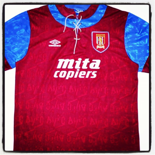
The early '90s were witness to a post-modern acknowledgement of past football fashions that complemented the technological advances and contemporary styles of the day. Out went the sleek, modernist approach that defined the '80s and in came proper old-fashioned collars and button-up plackets, inspired by kits of yore. In United’s case, though, Umbro pushed the retro feel even further and even introduced a lace-up collar – a style that in 1992 had last been seen regularly in football 60 years previously.

Combine this with the flamboyant, baggier shirt sizing that was widespread in fashion both on and off the pitch at the time, liberally decorate the fabric with a 3D geometric jacquard weave of the club’s initials, add the familiar and iconic Sharp logo and sprinkle just the right amount of red and black trim, and you have yourself a bona fide classic kit. One that was fit for champions.


Written by John Devlin, founder and illustrator of TrueColoursFootballKits.com.

John can be found on Twitter and True Colours is also on Facebook.

This shirt is part of The 50 Greatest Football Shirts Ever. The full list can be viewed here.

Sunday, 5 July 2015

[50GFSE] #36 - Watford 1985-88 Home Shirt by Umbro

Thanks to its combination of colours (how does the rhyme go again... yellow, black, red and green should never be seen?) this Watford shirt shouldn't work. The fact that it does, even as it teeters on the edge of an horrific colour clash, is testament to its greatness.

Click for larger version
Sponsor's logo aside, the kit is one of pure class and is another one of those designs that’s proved to be a forerunner of today's outfits thanks in main to the brazen red and black colour bar placed prominently across the chest, divided neatly with a thin yellow stripe. Quite a difference from the kits of the day that, in the main, featured just one primary shirt body colour.

It was a superb Umbro design that wasn't widely taken up by their roster but later, quite rightly due to its very effective way of accentuating a team’s colour scheme, found life in their teamwear catalogue.

Although recent years have seen Watford favour simply yellow and black as their primary colour combo, for me a large dollop of red (as was the clubs penchant in the '80s) is what really makes a Watford strip really buzz although arguably it doesn't sit comfortably with the yellow and black implication of the 'Hornets'.

The jersey also features that trademark of many mid-80s designs, namely the multi-trimmed V-neck and cuffs. In this case, the fact that the neck and cuffs are the same colour as the shirt just adds to the glamour of the jersey. Glamour - with all due respect, not a word you’d generally associate with Watford (apart from the patronage of Sir Elton, of course), but prove what benefits and strength a well considered and carefully designed strip can bring to a team's visual identity.

Back to the sponsor though... As mentioned earlier, in theory the inclusion of the Solvite logo in its corporate green should spoil the shirt, but in my view its this colour clash that helps give the shirt an added dimension. And it should be remembered, of course, that most shirt sponsors logos in the early-mid '80s were simply adapted to fit in with the colour scheme of their host team.

Thanks to this brave colour decision, all parties manage to come out of the deal with their visual identity and integrity intact, plus the sponsor gets maximum stand-out on the shirt (just imagine how a black logo would have visually disappeared under the chest colour bar).

Time can often change opinions of the aesthetic decency of a football shirt, though. At the time of its launch, its possible that the green Solvite branding may have upset supporters as interestingly it appears replicas were sold mainly without the Solvite logo. Their loss!


Written by John Devlin, founder and illustrator of TrueColoursFootballKits.com.

John can be found on Twitter and True Colours is also on Facebook.

This shirt is part of The 50 Greatest Football Shirts Ever. The full list can be viewed here.

Saturday, 4 July 2015

[50GFSE] #37 - Brighton & Hove Albion 1985-87 Home Shirt by adidas

As I hinted at in my write-up for the French 1980-84 shirt (number 38 in our run-down for those who missed it) It seems to me that adidas have always saved their best designs for the continent. It's certainly the case today where the flair and glamour of their European strips far overshadow creatively the more sober designs we see in the UK.

However, if I can take you back 30 years to a small club on the south coast of England... there was one set of strips that threatened to buck that trend.

Click for larger version
They belonged to Brighton & Hove Albion of the Second Division, and as far as I know their incredibly striking outfits were not worn anywhere else in the UK and were seldom seen in Europe, come to that.

It was a design that, lets be honest, remarkably wouldn't look out of place today amongst Nike and Puma's bold colour-block kits that are the current flavour of the month. The v-neck was identical to the one that formed part of the club's previous shirt with the merest suggestion of red adding a nice counterpoint to the blue and white. The main visual element of the shirt, though, were the three horizontal panels across the shoulders that were paired with a series of horizontal pinstripes positioned further down the jersey.

At the time, any shirt adornments were always pretty regular in format so this imbalance of proportion really helped the shirt stand out. Brighton have traditionally favoured blue and white stripes but since 1980 had worn solid blue shirts, so introducing a larger proportion of white back into the design, albeit at 90 degrees, must have gone some way to appeasing the Goldstone Ground faithful.

The origin of the design, and its puzzlingly few outings worldwide is unclear, the result being that its low profile has led it to being one of the most underrated kits of the '80s. The other most notable example of this design was sported by Anderlecht in the 1984 UEFA Cup Final against Spurs. Their version of the kit included an additional chest band that seamlessly led into a whole set of horizontal pinstripes running down the entire length of the shirt. Presumably it was decided that this impeded the clarity of sponsors logos and club badge (a fact that seems to have deserted the mindsets of many contemporary kit designers!) and these were removed from the Brighton shirt leaving a nice clear presentation area.

Two sponsors graced this fine, fine shirt – Phoenix Brewery in 1985-86 and the eternally humorous NOBO the following year, which just goes to show that having a double entendre as a sponsor still didn't manage to detract at all from one the classiest adidas kits to ever grace the Football League.


Written by John Devlin, founder and illustrator of TrueColoursFootballKits.com.

John can be found on Twitter and True Colours is also on Facebook.

This shirt is part of The 50 Greatest Football Shirts Ever. The full list can be viewed here.