Friday, 31 July 2015

[50GFSE] #9 - Africa Unity 2010-11 Third Shirt by Puma

Click for larger version
This is one of those shirts that frequently finds itself on those lazy 'worst football kits' lists that get trotted out by the papers every season when one club or another releases something different.

In addition to this, it's whole concept could be described as at the extreme of superfluousness, so why is it not only in the Top 50, but also in the Top 10 Greatest Football Shirts Ever?

Two predominant reasons...

One: Purely on aesthetics / design - Coming in the form of the standard Puma template for all the African teams at the time, it's rendered in sky blue, fading down into brown. Now, aside from these both being quality colours (check out the Attic logo), I'm a sucker for a fade effect. The colours aren't just a matter of whatever the designer fancied that day, they actually have meaning - the sky blue representing the African sky and the brown the African soil. A nice touch and one with some actual thought behind it.

Two: The concept. No I don't mean the sky / soil thing. The idea behind this kit's existence was peace and unity. As the title suggests, this was an African kit - Africa, of course, being a continent and not a single nation. The shirt was therefore designed to be worn by ANY African country* as a third shirt and indeed, the replica versions came with iron-on crests for all African nations*.

Alongside each individual country's badge, there was an Africa Unity crest on the left of the shirt. Replica versions also all came pre-printed with the number 10 and the word 'Africa' where the player's name would usually be,

(* supplied by Puma)

As it turns out, the shirt saw hardly any action, being used in only a handful of games, usually friendlies, so when it came to the ideal world stage of the 2010 World Cup, the first ever held in Africa, the kit, and with it the grand ideal of African unity, was nowhere to be seen.


Written by Rich Johnson (The Football Attic).

This shirt is part of The 50 Greatest Football Shirts Ever. The full list can be viewed here.

Retro Rewind - 'So Near, So Far: The 1991/92 Manchester United Season Review' (VHS)

Once again, ladies and gents, you're in for a treat as we welcome back Dave Burin to give you a review of a VHS tape aimed mainly at nostalgic Man United fans...
"What a goal from Clayton Blackmore.  He loves it, and so do the crowd!"

All these years later, I still love the famously oversexed full back's rocket of a strike, at a hostile Elland Road  It's been a shade over 23 years since this VHS first hit the shelves, just after the end of a season where triumph and despair mingled together uneasily amidst the rubble of the old Stretford End, pulled down after a final day victory in a 3-1 dead rubber tie against Tottenham Hotspur.

Whilst Manchester United's Class of '92 embodied a freak of nature, a youth side compiled of numerous future Premier League stars, its story was almost timeless. The gaggle of Giggs, Beckham, Gary Neville and even Robbie Savage, would have made headlines in 1965 or 2015 for the abundance of natural talent on display. But the story of that season's first team and the backdrop to their matches feels more definite. It feels more 1992 than the Class of '92's story. It's become a common cliché, but there's relevance to the argument that this was the last year of old football - depending on who you ask, perhaps, 'proper football'.

With the hindsight of time, and the club's enormous success in the intervening 23 years, watching through the build-up to our most infamous title collapse feels more like an exercise in nostalgia than an act of self-masochism. The title cards for each game mix brightly coloured scrapbook animation with short glimpses of the action to come, like some ill-advised crossover between The Big Match and Saved by the Bell.

With the distance of time, what seemed standard then, now seems lovably quaint. Sheffield United were sponsored by Laver, a timber company, because financial corporations and loan companies were simply not manly enough for Sheffield. During United's away game at Oldham Athletic, Denis Irwin jubilantly celebrates a goal whilst a woman walks along the touchline pushing a trolley which seems to be conveying a large vat of soup. What a time to be alive!

Even the names of certain opposition goalscorers evoke a sense of cosy familiarity - some long forgotten, but instantly conjuring up memories of half time Bovril, obscenely short shorts, Shoot! magazine and any other clichés you'd like to add to that list. Frank McAvennie. Nigel Jemson. Mike Milligan. Even Ian Rush's 'tache feels vaguely historic, a remnant of a time when the giants of the English game cribbed their facial grooming tips from Ron Jeremy. This was also a time before the choreographed monotony of the synchronised celebration. Steve Bruce flaps his arms like an overly-excitable eagle, after each goal he scores. It's the way things should be.

On that note, I should probably talk a bit about the football - and more specifically, the brand of football United played. Despite the eventual disappointment of the league campaign, there were magic moments. Young Ryan Giggs nets a stunning solo goal in a 3-0 home triumph over Norwich City. The Reds produce a slightly reckless attacking masterclass at Boundary Park, beating Oldham 6-3.  A 5-0 trouncing of an admittedly dire Luton Town (see left). Bryan Robson's late, great winner at White Hart Lane. This was a side that embodied excitement and entertainment. Harry Redknapp would have called them "T'riffic".

But, for all their attractive football, neither Man United nor eventual champions Leeds needed to be that good all of the time. Whilst in the big money, high-pressure Premier League of 2015, serious mistakes are something of a rarity, on the boggy pitches of 1992's First Division, they were alarmingly frequent.

In this one review video alone, Sheffield Wednesday's defenders clatter into each other on the goal line after a terrible backwards pass, and Brian McClair sneaks in to score. A Luton Town defender falls over his feet, leading to a United goal. Spurs stopper Ian Walker kicks the ball about four yards to limply set up a United goal. Peter Schmeichel concedes a few goals by just standing around the box looking slightly bored, as if waiting for a delayed bus to arrive.

It's all interspersed with interviews, of course. These were the dark days before a gurning Jim White held Sky Sports News hostage interviewing surprised players through car windows, and before United's centre backs could post every ridiculous thought they had on Twitter (love you really, Rio!). Bryan Robson is interviewed in what appears to be his living room. A reflective Alex Ferguson talks with a surprisingly resigned sadness about the season past. "We're not looking for excuses" he says, with a shrug of the shoulders.

The last jubilant moments take place at Bramall Lane and Wembley. The away victory against The Blades is a moment of pure, joyous early '90s emotion. The screen is awash in slightly fuzzy figures leaping over the terracing barriers, a unified mass of oversized padded jackets, technicolour shellsuits and uniform bowl cuts.  No hipster combovers here.

The footage in the build-up to the Rumbelows Cup Final is perhaps the most interesting feature of all. It's a document of how much everything has changed. Club officials eating a fried breakfast on the train with eager young lads in face paint and carrying homemade flags and banners. Workers at Manchester's Victoria station wearing red rosettes reading 'Good Luck United!'  It feels like another world to the football where Manchester City spend £49 million on an unspectacular player and parade him in front of a stage-managed set of 'fans'.

United win the Final 1-0 against Nottingham Forest. The trophy is presented by the 'Rumbelows Employee of the Year' - because apparently selling lots of computer keyboards translates into getting to give Steve Bruce a trophy. Anyway, it's a nice touch. Paul Ince is wearing a bucket hat. Peter Schmeichel is wearing a fez and throwing the kit man into a full bath in the dressing room. By this point I'm trying not to think too hard about the football - because I know what's coming next.

Even now, the last 10 minutes of this VHS review feel akin to the culmination of a shlocky but especially grisly horror movie. The fun part is over. Something horrific is about to happen, and though part of you wants to avoid it, you continue watching - compelled - knowing that the smiling faces will turn to masks of despair. United lose twice to Nottingham Forest. They lose at West Ham. Some pretentious git named Cantona keeps scoring for Leeds, and they go on to lift the title. It's all rather grim.

Alex Ferguson flashes back onto the screen, immaculate in jacket and tie. "The demands... of everyone means you have to win titles," he says meaningfully. Over the following two decades, those demands would be met and surpassed with incredible regularity. Even in 1993, though, winning the Premier League would feel somehow different to winning the First Division. Not better or worse, simply other.

The moustaches would be trimmed. The acid blue away kit would be retired, and left to the nostalgists and curios. The pitches would improve. Even the season review soundtrack, here a pleasant enough background noise which probably appeared on old PC screensavers, would get an upgrade. The times, they were a changin'.

Even if you're not a Man United fan, we're sure you'll agree that Dave's reminder of how things were back in the early-'90s was very evocative and a really great read. Thanks Dave!

If you want to catch more of Dave's guest posts at the Attic, you'll find the links below, or if you want to follow him on Twitter, be sure to find Dave at @GoldenVision90.

More from Dave Burin:

Thursday, 30 July 2015

[50GFSE] #10 - England 1980-83 Home Shirt by Admiral

There's no written rule that says football shirts have to reflect the fashion trends of the era in which they're born, and yet many do. Think of the football shirts of the 1960's: basic, functional, unshowy... Until Twiggy started wearing spangly mini-skirts, the word 'flair' hadn't even been invented.

Then when the 1970's arrived, colour flooded into everything from TV programmes to home décor as creativity and imagination underpinned art, architecture, clothing and much more besides.

And after that, the 1980's came along, where fashions became... well... 'sensible.' But you know what? By the early 1980's, we all needed a bit of sensible. It was time to take stock of what had gone before and forge ahead with understated design that was modern and sleek without being ostentatious.

Click for larger versoin
This was the very essence of how England's 1982 World Cup shirt came to be. Thanks to Admiral Sportswear, the England team had moved from basic unambiguity to tentative boldness with their 1974 kit, but six years down the track, it was time embrace a new decade. Out went the old-fashioned stripes down the sleeves and in came silky polyester, a continental-style collar and bold shoulder panels.

Naturally enough, it rubbed a few people up the wrong way. BBC TV commentator Barry Davies, upon seeing England wearing the new kit for the first time against Argentina in 1980 said "England wearing their new kit today... although why it has to have all the colours of the Union Jack is beyond me." Truth be told, the previous kit had also featured the same red, white and blue, but the shirt was predominantly white. Now... well... this.

The thing is, half the world's football teams seemed to be wearing the three stripes of Adidas on their shirts by this point, and very stylish they looked too. Adidas had become THE football brand to wear, whereas Admiral... well, to put it politely, their day had been and gone. Their iconic designs of the 1970's reflected the decade perfectly but were suddenly out of step with the 1980's. Even this new shirt that would go on to be worn at the 1980 European Championships and the 1982 World Cup somehow didn't have the allure that Adidas could provide.

And yet, we all missed the point and still do. At the start of the 1980's, fashion trends were becoming more modest, more muted, more... 'M&S'. Shirts didn't need wide collars, fiddly detail and wacky colours. This was a new era where 'modern' and 'smart' were the watchwords, and the new England shirt embodied those values perfectly.

Finally, let it not be forgotten that you, our knowledgeable Football Attic audience, have already declared this your favourite England shirt of the last 50 years - a considerable achievement given its attachment to a fairly ho-hum period in English football history. What it does attach itself to, and perhaps why it's already proven to be so popular, is its forward-looking modernity symbolising hope for a bright new future. Yes, football shirt design was capable of being technically better or more exciting, but this was the right shirt at the right time, and executed with great discretion to boot.

So there we have it: a shirt whose greatness has been earned through its imperfection, you might say. Not as stylish as Adidas with all their fancy pinstripes, but a neat 'of its era' shirt worn with pride by dozens of players from John Barnes to Kevin Keegan - and there can be no doubt: they all looked absolutely bloody great in it.


Written by Chris Oakley (The Football Attic).

This shirt is part of The 50 Greatest Football Shirts Ever. The full list can be viewed here.

Wednesday, 29 July 2015

[50GFSE] #11 - Wales 1976-79 Home Shirt by Admiral

It's time once again for us to welcome a guest writer into the 50GFSE fold, namely Simon Shakeshaft - Welsh football fan and an esteemed authority on the many and varied shirts worn by the national team. Here he is to discuss a classic vision in red, gold and green...

On this countdown the ‘template’ word has already appeared on a number of occasions. This Admiral shirt design is another one of those, a template. No disrespect to Eintracht Frankfurt, Dundee, Saudi Arabia, Vancouver Whitecaps or even Coventry City who actually had it first (even in their infamous shade of russet), but this is probably the most recognisable.
Click for larger version
The FAW joined the pioneering shirt designer’s revolution in 1976, just as the replica shirt market started to really take off, donning the same iconic Admiral ‘tramlines’ design until the end of the decade.

The colour combination of all red with the two arched ‘tramlines’ stripes in yellow and green, from the shoulders vertically down each side of the shirt’s front, was perfect for a Wales shirt. What separated this one from others in this template was the Welsh dragon crest placed centrally on the chest. The Admiral logo had to be moved onto the winged collar, meaning they could use two, and this appeared to give the shirt more of a balanced look.

Remember the tramlines were even more enhanced by the fact they continued down the front of the matching red shorts. A great colour combination for a Wales shirt, although I'm not quite sure about Admiral’s marketing explanation for the colours. ‘Red for the dragon’, yes... ‘yellow, for the daffodil - Wales’ national flower’, yes ok... ‘green for the leek, the national vegetable’... Seriously!!!  Not totally necessary justification for an 11-year-old - after all, Wales away colours were traditionally yellow with a green trim and I don’t think Umbro use of those colours’ would have been explained in quite the same way in 1949. The away kit of this design was another beauty, a reverse of home in the traditional daffodil yellow with tramlines in red and green.

By the mid-Seventies, the Welsh national football team were enjoying a bit of a purple patch, the only one of the home nations to qualify for the quarter finals of the 1976 European Championships and a controversial failure to qualify for Argentina ’78 World Cup due to the hand of Jordan.

It was a great time to wear your replica Admiral Wales shirt with pride, although it was also a time when it was deemed semi-acceptable to see non-Welsh kids wearing the shirt, such was its appeal. In the late Seventies - and early Eighties, if you’re English - Admiral replica shirts carried the same status that, later, a pair of Jordan Air Max did.

You weren't really fazed by the scratchy, itchy, small electric shock of the nylon material or the fact that your previously shiny vinyl crest and logos cracked and peeled after Mum washed it for the umpteenth time. Wind forward 25 years from when I first held a cotton player’s shirt in my hand and imagine my joy in finding out these also came in an aertex perforated hole variety... it was nearly too much to take! The cloth crest, logos and numbers stitched to the shirt were a work of art and that buzz, even today, is still the same.

If you missed the Seventies replica shirt boom, you probably don’t really get all the fuss made about Admiral Sportswear, but for those that were there, many are now iconic classic shirt designs. For me and many other Welshmen, the Wigston factory in Leicestershire produced the finest Wales shirt of all time.


Our grateful thanks to Simon 'Shakey' Shakeshaft. He can be followed on Twitter here and his website, Wales Match Shirts, contains everything you need to immerse yourself in the wearable history of Yorath, Giggs, Southall and many, many more.

Tuesday, 28 July 2015

[50GFSE] #12 - Boca Juniors 1981 Home Shirt by adidas

I must confess to not being much of an expert on South American domestic club kits. I guess the relatively low profile many of the sides have in Britain (or certainly had during my kit awakening in the late '70s) is the reason. In fact probably the only fact I seem to have retained about shirts south of Mexico way is that at some point or other they all seem to have been sponsored by Coca Cola.
However, one South American shirt design has always stuck in my head for its originality, freshness and simple downright coolness,  and that’s the iconic blue and yellow home strip worn by Boca Juniors - arguably Argentina’s most famous club.

Click for larger version
With so many wonderful interpretations of the big and bold design to choose from, its this early-'80s adidas incarnation that just edges it for me. It has a higher-than-usual profile, no doubt aided and abetted by the fact that it was worn by football legend Diego Maradona when he signed for the club in 1981. Proof that a world class footballer can really help get your kit seen and noted around the globe.

Of course all Boca home shirts are dominated by the in-your-face yellow band stretching across the chest. Its a remarkably simple but remarkably effective piece of design and one that has influenced many contemporary kits where large colour blocks are used to dramatic and dynamic effect. None, however, wear them with as much as panache as Boca. Perhaps it's the fact that the chest band often seems to appear just a little deeper than would be obvious?

The shirt was way ahead of its time in terms of fit and style and was beautifully put together with a thin and rather low-slung wrapover crew neck accompanied by the always stylish version of the adidas trefoil logo, minus the text and of course their trademark three-stripe trim. Interestingly for the era, there are no cuffs on the shirt; a decision perhaps prompted by the high South American temperature.

The kit was actually first worn in 1978 but it wasn't until 1980 that the final small (but very important) finishing touch was added in the shape of the four-star Boca Juniors badge. Each star houses the letters ‘C A B J’ which, of course, stands for Club Atlético Boca Juniors.

Its always puzzled me why this stunning strip design hasn't been ‘borrowed’ by more clubs, and in fact the combination of blue and yellow in this way is also relatively scarce. Legend has it that the distinctive colour scheme was apparently inspired in rather curious circumstances.

The story goes that another Argentinian side, Nottingham de Almagro, wore a similar kit to Boca and so in 1906 a one-off match was played to decide who could keep the colours as their own. Boca lost and decided to wear the national colours of the first boat to sail into port at La Boca the following day. It turned out to be a Swedish boat, Drottning Sophia, and so the classic blue and yellow colour scheme was born.

I can’t help but think Boca clearly eventually came out as winners in the fashion stakes, though.


Written by John Devlin, founder and illustrator of TrueColoursFootballKits.com.

John can be found on Twitter and True Colours is also on Facebook.

This shirt is part of The 50 Greatest Football Shirts Ever. The full list can be viewed here.

Monday, 27 July 2015

[50GFSE] #13 - Manchester United 1992-94 Third Shirt by Umbro

We should never let the truth get in the way of a good story, and boy is the background to Manchester United's 1992-94 Third shirt a good story. If you're sitting comfortably, then I shall begin...

Click for larger version
Actually, let's just cut to the chase. The legend goes that Man United's forebear, the Newton Heath (Lancashire & Yorkshire Railway) Cricket & Football Club, were presented with cashmere shirts in green and gold in their second season in existence. In fact, reports of such an item existing are scarce, and it may be not beyond the realms of possibility that until Umbro came up with this supposedly retrospective design to add to their new United Home and blue Away shirts, neither the Red Devils nor their progenitor ever wore green and yellow/gold halves.

But no one knew that in the early 1990s, we have to believe, and black and white photographs from one hundred odd years previous, along with isolated reports, somehow suggested this palette - the colours of the L&YR - though there is far more evidence for the wearing of a suspiciously similar outfit in red and white in subsequent seasons. So along came this ostensibly historically sensitive shirt, complete with the lace-up collar seen on the Home version and complex jacquard watermark, dispensing with the alternate-coloured sleeves and embellished with tasteful black trim, not to mention unveiled in hilarious fashion - with Eric Cantona stealing the show not for the last time.

And it was brilliant. The connotations worked fantastically - we doffed our caps, 1879 style - whilst the adding of more modern stylings - that watermark, the Umbro logo, the sponsor - seemed to act as the anachronism's membership card to the present, like The Terminator's clothes, boots and motorcycle. Truly, has a footballer ever looked sexier than when Andrei Kanchelskis digested his expulsion from the 1994 League Cup final whilst wearing this shirt, long-sleeved and untucked?

It may be that revisionism was at play to provide us with this masterpiece - or maybe it's at play in this article - but the colours have since, entirely owing to this release, been adopted by the anti-Glazer factions amongst United's current support. Consequently, a whole mini-industry of green and gold wares exists with a raison d'être of protestation, due not to the origins of the club - oh, you poor innocent - but to the unashamed glorious commercialising of said origins in 1992.

And you can buy a retro Newton Heath shirt - some have the colours flipped, layering confusion on confusion - but the root of the green and gold phenomenon may be found late in the last century. We'll never really know, and perhaps Umbro have created an alternate, paradoxical backstory to one of the world's biggest clubs. Perhaps. What is certain is that Umbro created a wonderful shirt that becomes rarer and exponentially more valuable as time passes. Those rail workers wouldn't want it any other way.


Written by Jay, resident blogger on DesignFootball.com.

Jay can be found on Twitter and DesignFootball.com are on Facebook and Twitter.

This shirt is part of The 50 Greatest Football Shirts Ever. The full list can be viewed here.

Sunday, 26 July 2015

[50GFSE] #14 - Italy 2000-01 Home Shirt by Kappa

When a football kit manufacturer decides to rip up the rule book and completely reinvent what's gone before, it has several options to help it achieve its objectives. It can add an eye-catching motif to the shirt here or there - a stripe or a block of colour, perhaps. It can add extra detail or interest to make the shirt more complex in its make-up. Or, as with Kappa's approach to the Italy shirt of 2000-01, it can go in the opposite direction by simplifying things in a brilliantly innovative way. This is the masterpiece that came about from that little exercise:
Click for larger version
There's no other way to describe this shirt: it was quite simply a game-changer. Before 2000, shirts worn by the Italian national team all generally followed the same rules. They had to be royal blue in colour, many had a proper 'flappy' collar and many had a dash of green, white and red as borrowed from Italy's national flag. After a couple of years of towing the line, however, Kappa decided to break free from the conventions of yore.

Their first idea was to change the tone of blue - a potentially controversial move, but one based on precedent as the Italy shirts of the 1950's had a similar hue. If you go back to the 1930's, you'll see that the shade of blue is even lighter, but I digress. Though a little jarring when first seen 15 years ago, it undoubtedly has a softer quality than the deep, rich blue we've come to associate with the Italian team.

Next, Kappa did away with the collar, opting instead for a simple round neckline in the same colour as the rest of the shirt. After that, they moved their own logo to the sleeves of the shirt to leave the body decorated only by the traditional 'shield' badge of the Italian Football Federation.

The final change, however, was a master-stroke. To compensate for an apparent lack of detail, Kappa used decorative stitch-work in a darker shade of blue to create a feature in its own right. Providing a border around the neckline, under the arms and down the sides of the shirt, this was a genius move that added to the overall look without spoiling the simplicity that had already been implemented elsewhere.

If anything, the addition of a white squad number in the middle of the chest (as seen during Euro 2000) made the shirt even more complete, but it was by no means necessary. Even the slightly slimmer fit provided an extra distinction that separated it from most other shirts seen around the same time.

All in all, this was a glorious symphony of subtlety and style that did much to boost not only the Italian national team but also Kappa themselves. Proving that less can most certainly be more, Italy's greatest football stars have rarely looked better on the international stage.


Written by Chris Oakley (The Football Attic).

This shirt is part of The 50 Greatest Football Shirts Ever. The full list can be viewed here.

Saturday, 25 July 2015

[50GFSE] #15 - Hull City 1992-93 Home Shirt by Matchwinner

It's fair to say we all had a soft spot for this oft-criticised shirt, but to give it the proper tribute it deserved, we thought we'd hand over the writing duties to Hull City kit expert Les Motherby. Here he his to tell the story of a football shirt with stripes of a truly different kind...

For a kit to become ingrained in the collective consciousness usually requires a team to perform laudable exploits while wearing it; win a major trophy, secure promotion, or at least embark upon a plucky cup run. Not so with Hull City’s 1992/93 home kit, worn during a season of abject failure: The Tigers narrowly escaped relegation from the third tier of English football, exited the League Cup at the first hurdle, and bested only Darlington in the FA Cup before going out in the Second Round.

Click for larger version
It is purely the design that secured this kit’s enduring infamy, which is an impressive feat considering the era, when outrageous designs were legion. Clubs had cottoned on to the money-making potential of polyester replicas released annually rather that every two years, suppliers were pushing design boundaries to show off new printing techniques and a rash of small kit-making firms were keen to make a name for themselves, culminating in an imperfect storm regarding kit design. But whereas most of the, ahem, attention-arresting designs released during that period were used for away kits, it was Hull City’s home kit that would be quite literally wild.

Scottish brand Matchwinner looked to the club’s nickname for inspiration, producing a lurid tiger stripe print shirt, paired with black shorts and socks with amber trim. Near universally mocked outside of East Yorkshire, this shirt is fondly recalled by many Hull City fans, who revel in the kitsch value and remember the media hoopla generated as a rare bright spot in an otherwise bleak decade.

Those who claim this to be among the worst kits ever are seemingly ignorant of its successor, which was essentially a knock-off. The five-year relationship between Hull City and Matchwinner came to a sudden and acrimonious end in the summer of 1993, giving replacement supplier Pelada no time to design a non-copyright violating approximation of the tiger-skin print shirt.

So The Tigers began 1993/94 with the previous season’s shirt and shorts (Pelada supplied new socks) with Matchwinner’s logos patched over, it wasn't until the November when City wore Pelada-made home shirts for the first time.

Only the ‘tiger skin’ looked more like a leopard print, and featured such a tightly compacted design that from a distance the shirt looked a rusty hue, rather than our usual distinctive and bright amber. Indeed when Oxford visited Boothferry Park they were permitted to wear their yellow primary shirt, deeming it not a clash with our supposedly amber and black shirt. It was so bad that even fans who loathed the original tiger print shirt will have pined for it after seeing the shockingly bad substitute.

The original might have been ill advised (and the concept is certainly best left in the past), but it was fun and generated more publicity than a side ranked 20th in Division Two of the Barclays League warranted. To this day it remains memorable and iconic.


Our grateful thanks to Les. He can be followed on Twitter here and his website, HullCityKits.co.uk, has much more in the way of kit imagery and information for those of you interested in what The Tigers wore in days gone by.

Friday, 24 July 2015

[50GFSE] #16 - Ipswich Town 1982-84 Home Shirt by adidas

Earlier in this series we saw how adidas’ instigation of pinstripes in 1980 kick-started a continental influence on kit design. A year later the fashion finally made it to the UK with one of the best examples of the genre - the Ipswich Town shirt worn in the halcyon days of Bobby Robson’s management, sported by stars such as Paul Mariner, Arnold Muhren and Terry Butcher.

Click for larger version
There were (and in fact still are!) plenty of pinstripes around in football, but when they form part of a shirt featuring non-contrasting neck and cuffs they do seem to exude that little extra ‘je ne sais quoi.’ I guess its the perverse nature of stripping away contrasting colour from the functional elements of the design before then adding it again, purely as decoration, elsewhere on the shirt. It's confident (or arrogant?) and extravagant in the extreme, but actually is precisely what you need when you’re dressing a football team when their confidence is paramount to performance.

As if to prove a point, this is yet another example of a superb kit accompanying a superb team (for those who may not remember, the early 1980's found the Tractor Boys’ stock much higher than it is today) although to be fair, their peak had arguably just passed when these pinstriped beauties were called into action.

The shirt is also memorable for the inclusion of Ipswich’s first ever sponsor, electronics company Pioneer. The early versions of these shirts (as worn in pre-season photos) featured the firm’s solid but relatively squat logo. Clearly there were concerns about legibility and brand awareness as soon into the season these jerseys were replaced by new ones that featured, in a move to make all graphic designers wince, a condensed but much larger rendering of the Pioneer logo.

The European flavour of this shirt is clear to see (quite apt given the club’s success in the UEFA Cup the previous season) and for my money produced, along with its white away and red third counterparts, one of the classiest and most stylish sets of kits of the decade.


Written by John Devlin, founder and illustrator of TrueColoursFootballKits.com.

John can be found on Twitter and True Colours is also on Facebook.

This shirt is part of The 50 Greatest Football Shirts Ever. The full list can be viewed here.

Thursday, 23 July 2015

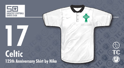
[50GFSE] #17 - Celtic 2012/13 125th Anniversary Third Shirt by Nike

There are many ways to commemorate an anniversary with shirts; some good, some bad. Celtic's last major anniversary was their centenary in the 1987/88 season, which they celebrated in the typical fashion of the time - adding some wording under or around the crest. Celtic went one better and reverted to their original crest for the season, but that was it. No special shirt, no great pomp and ceremony, or marketing BS... Just a classy shirt with some wording and it worked perfectly. It was classy at the time and even today looks fantastic.

So, 25 years later and with the next major milestone looming, what to do?  The world had changed and with special edition shirts being released almost every day celebrating such mundane things as when some bloke off a student's t-shirt dropped by your place 50 years ago, the big question was how to mark the occasion?

Celtic's answer? Create one of the classiest special edition shirts ever!

Click for larger version
For a start, they replicated the centenary shirt by having a special crest for the home shirt, but this time round they created a special Third shirt as well. What they came up with was a replica of what they wore the first time they played their Auld Firm rivals, Rangers, from May 1888. The kit as a whole was beautiful, with black shorts and green and black hooped socks, but this isn't about the kit as a whole, this is just about shirts... So could the jersey stand on its own? By god yes!

The shirt itself was all white, topped off with a small, black collar so we're starting with a minimalist cool look already, but what really makes this shirt special are two subtle details. As with the 87/88 shirt, they changed their badge to their original Celtic cross, albeit in updated form, but it's what's beneath the crest that tops this shirt off nicely.

Sponsors logos are a touchy subject on shirts these days, so when it comes to an anniversary edition, how would such a classy, retro looking shirt look with 'Tennents' sprawled across it?

This problem was solved beautifully by the lager manufacturer allowing their logo to be rendered in white, subtly outlined in grey, and in a small version, just below the badge. This was a classy move by Tennents, which showed smart thinking. They didn't ruin the shirt and would no doubt have won people over by not doing so,  Nike followed suit and the swoosh also appeared in white, leaving what appeared to be a retro-styled shirt bereft of logos of any kind. I don't think there's been a classier anniversary shirt.

As a side note, Rangers, themselves sponsored by Tennents, also had the sponsor logo in the same size and placing, so as not to create any imbalance across the divide.


Written by Rich Johnson (The Football Attic).

This shirt is part of The 50 Greatest Football Shirts Ever. The full list can be viewed here.

Wednesday, 22 July 2015

[50GFSE] #18 - Aberdeen 1976-79 Home Shirt by Admiral

You know, the more I study football kit history the more I appreciate just how big and far-reaching the effects of the Admiral mid-70's kit revolution were. The kit they produced for Aberdeen back then, worn just as the club were beginning a golden era under the managerial reign of a certain Alex Ferguson, is a fine example.

Click for larger version
Prior to 1976, The Dons had enjoyed a succession of relatively plain and simple red kits. Nothing wrong with that of course, but Admiral’s bold approach, born from a need to produce copyrightable designs that could be subsequently sold as replicas and inspired by the ever increasing role of colour TV in the football world, lifted the ordinary Aberdeen kit into something extraordinary.

It was the simple addition of five (or occasionally four as, in true Admiral fashion, the finer details did vary) thin vertical stripes all grouped together on the left hand side that really made the kit stand out. The fact that these stripes then continued on the shorts raised its kudos even higher.

And that was it. That was all the kit required. No concepts, no symbolism - just the beauty of pure aesthetics. Hell, it was so good, it didn't even need a club badge! But whether it was being worn in a football stadium or the local rec, it was unmistakably Aberdeen, no doubt about that.

A few other clubs also sported this design but none of them wore it quite as well as The Dons and is fondly remembered by Aberdeen fans of a certain age.

The fact it was donned (ahem) in a couple of vital and formative cup finals en route to Fergie’s prime at Pittodrie seems only fitting.


Written by John Devlin, founder and illustrator of TrueColoursFootballKits.com.

John can be found on Twitter and True Colours is also on Facebook.

This shirt is part of The 50 Greatest Football Shirts Ever. The full list can be viewed here.

Tuesday, 21 July 2015

[50GFSE] #19 - Argentina 1986 Home Shirt by Le Coq Sportif

Just after the 1986 World Cup had finished, I purchased my first ever Shoot! magazine with a World Cup review in it. On the front cover was Maradona cradling the World Cup trophy, wearing the gorgeous blue and white striped shirt that would beguile me to this day.

Click for larger version
The two things (and this demonstrates how incredibly obsessive I am about this stuff) that hooked me were the fact the central stripe was white and not blue - a rarity for Argentina - and that it was made from an Airtex material. Yes. I really do love a shirt due to the inclusion of holes.

In addition to the holes, it just looked gorgeous in the Mexico sun, especially when contrasting with their black shorts and white socks.  It also never looked better than in the Final against a West Germany team in their vibrant green shirts.

The shirt itself is a very simple affair, being nothing other than white- and blue-striped Airtex material with a standard round neck, but to me that's part of its appeal. I don't think a shirt would be made like this any more. Yes, we've had the whole retro-looking 'Tailored By' range from Umbro, but aside from those (and even then there were few striped shirts where the sleeves were just the same exact style as the body), you just don't get shirts where the sleeves just continue the main style with no additions or changes in style whatsoever.

To me, this shirt is proof that at times, a design doesn't have to be anything other than what it needs to be, while still being unique. Though it may be simple in nature, the change of central stripe to white and the Airtex material raise this from plain shirt to design classic.


Written by Rich Johnson (The Football Attic).

This shirt is part of The 50 Greatest Football Shirts Ever. The full list can be viewed here.

Monday, 20 July 2015

[50GFSE] #20 - Olympique Lyonnais 2010-11 Away Shirt by adidas

As with the previously mentioned Marseille shirt, this was from the period where adidas were providing French teams with what some regard as strikingly unique and extravagant designs and other, less educated/cultured folk regard as abominations. I am clearly in the former camp, hence this shirt's initial nomination and, due to the others on this project being of a similar ilk (though not cultured enough to appreciate the aforementioned Marseille shirt), subsequent inclusion in the chart.
Click for larger version
Flouncing in in a deep burgundy, the front is adorned with what appears to be a pattern inspired by a Las Vegas casino carpet and given all the trim is in gold, one could be forgiven for thinking the whole ensemble was conceived somewhere on the Strip.

And this is where that difference of opinion come in. While some think the result is gaudy, tacky or just plain awful, I, and my esteemed colleagues, all deem this to be a masterpiece of design and style.

The print is a triumph of gorgeously indulgent, swirling symmetricality (yeah I know the word is symmetry, but that doesn't sound half as good!) in a darker burgundy than the rest of the shirt. From a distance, it resembles a Rorschach ink blot test, which makes you wonder what the designer saw when he looked at his creation... Maybe his mother scolding him for not having a sensible job... and why isn't he wearing a coat, it's cold outside, you'll catch your death Martin!!!!

Again, similarly to the Marseille shirt, the trim is all gold and while some say it jarred against the blue, here it just adds to the luxury feel (or the tackiness, if you're a berk).

One final detail is something that only those who purchased a certain version of the replica shirt would have seen. The numbers on the back, as well as being available in boring old block fonts, were also available inset with the same pattern as on the front of the shirt, but in gold. Damn that's some good detailing right there!


Written by Rich Johnson (The Football Attic).

This shirt is part of The 50 Greatest Football Shirts Ever. The full list can be viewed here.

Sunday, 19 July 2015

[50GFSE] #21 - Universitario 2013 88th Anniversary Shirt by Umbro

And so we come to another limited edition shirt on this list (yet again nominated by me), though this one encountered very little resistance due to its staggering beauty.

Released to celebrate Peruvian club Universitario's 88th year (oh come on, since when has that been any kind of event?), Umbro stripped things right back and went full-on retro.

Click for larger version
Despite being a very minimal design, there are several features that make this shirt great. Firstly, the whole thing is constructed from Umbro's lush cotton used on so many of their 'Tailored By' range.

And then there's the details. Starting from the top, we find a neat, trimmed collar which then has a neck opening that extends almost all the way down to the abdomen; a brave move given how most manufacturers still try to keep their tribute shirts within the bounds of modern features.

The club crest - a gorgeously simple U in a circle and rendered in maroon - is quite thick, luxuriously stitched on and again, really feels like it would have done in days gone by.

The Umbro logo, rather than going with just the diamond (as they did for most of their 'Tailored By' range), has the company name underneath, akin to their '80s logo - a strange choice given the look they're clearly going for. Similarly, along the shoulders at the back of the shirt, is a maroon line extending from the neck, a superfluous detail that looks somewhat modern and therefore out of place. It's all very well going for a mix of modern and retro (a la Corinthians), but this only works when the shirt doesn't have its foot so heavily planted in one camp to begin with.

Thankfully, these details don't detract too much from the overall look and to further enhance the shirt, the numbers are stitched on in contrasting thread. Finally, the sleeves are trimmed in thick cuffs and it's these details that truly make this shirt the work of art it is.


Written by Rich Johnson (The Football Attic).

This shirt is part of The 50 Greatest Football Shirts Ever. The full list can be viewed here.

Saturday, 18 July 2015

[50GFSE] #22 - Dundee United 1984-87 Home Shirt by adidas

As is clearly evident by a quick scan through our the preceding entries in our 50 Greatest Football Shirts Ever series, adidas were enjoying a golden era during the 1980s and seemingly could do no wrong. This rich vein of kit design form continued north of the border with their 1985-87 kits for Dundee United that are splendid examples of the quality of their strips during this period.

Click for larger version
Adidas had been residents in the kit room at Tannadice since 1977 and this, their third home kit for the Arabs is arguably their best with so much to admire within it.

Much to the excitement of kit nerds at the time (well, me anyway) the shirt featured dynamic DIAGONAL shadow stripes - a new development in this most stylishly subtle way to decorate a shirt. The trend for including a third hue to kit trim in the mid-80s suited the club’s tangerine and black colour scheme a treat with the newly introduced white adding a whole new level of sophistication to the ensemble.

The shirt is also notable for the inclusion of the rather smart and angular logo of supermarket/convenience store chain VG, the side’s first ever sponsor. VG's parent company included future United chairman Eddie Thompson as part of their managerial board and it was Thompson himself who engineered the deal with the club. Interestingly the VG logo on replica jerseys was much smaller than the ones on the players’ versions.

Adidas obsessives will note the truncated three-stripe trim (yes, this was back in the days when adidas did something different for a change with their most famous branding adornment!) that stopped neatly at the shoulder in a similar style to that also sported by Liverpool at the time. The epaulette-like rendering of the three stripes seemed to give the shirt extra gravitas and strength which suited perfectly a very impressive Dundee United side who, at the time, were enjoying their own golden era and rampaging through Europe in the UEFA Cup whilst wearing this kit.

In fact this strip’s last outing was against Gothenberg in the second leg of the 1987 UEFA Cup Final where sadly a 1-1 draw was not enough to avoid an aggregate defeat to the Swedish side (although to give credit where credit’s due, United had already knocked out Barcelona earlier in the tournament).

For me, this kit is another superb example of a great outfit accompanying (and possibly inspiring?) a great team - and you must remember that in the mid-80s Jim McLean’s side were pushing the Old Firm all the way for domestic honours... which was given extra spice by the notion of the logo of a pretty small Scottish convenience store appearing in some of the biggest stadiums in Europe!


Written by John Devlin, founder and illustrator of TrueColoursFootballKits.com.

John can be found on Twitter and True Colours is also on Facebook.

This shirt is part of The 50 Greatest Football Shirts Ever. The full list can be viewed here.

Friday, 17 July 2015

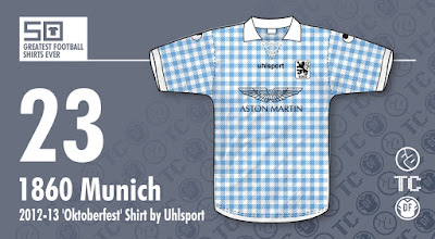
[50GFSE] #23 - 1860 Munich 2012-13 'Oktoberfest' Shirt by Uhlsport

I am a sucker for limited edition shirts. Release a shirt with a crazy design, celebrating X number of years since your club first played on a Sunday or the anniversary of when they wore purple that time 63 years ago for some reason and I'm there, waving my cash like a hardened strip club patron.

That said, in recent years there have been so many limited edition shirts that not only is it impossible to buy them all, like some kind of kit pokemon, but too often the limited edition isn't much to write home about.

On the latter point, this delivers on all fronts!

Click for larger version
Released in 2012 (from what I can find out) this was the first of, to date, three Oktoberfest shirts released by the Munich club and is by far my favourite.

Based on the chequered blue and white flag of Bavaria (the Rautenflagge), the shirt is rendered in a gingham pattern all over, complete with a lovely retro lace up collar. The shorts and socks that went with this were brown and the combo of light blue and brown is, as far as The Football Attic is concerned, perfect.

The shirts that followed never quite lived up to the beauty or uniqueness of the original; the 2013 version having lime green trim and the 2014 one being a non-gingham version of the 2012 shirt.

Finally, as with all good limited edition shirts, this was actually worn in a match, during the club’s September 23rd league tie with Eintracht Braunschweig. Nothing worse than a limited edition shirt that's made purely for cash now...
 
Written by Rich Johnson (The Football Attic).

This shirt is part of The 50 Greatest Football Shirts Ever. The full list can be viewed here.

Thursday, 16 July 2015

[50GFSE] #24 - Crystal Palace 1972-73 Home Shirt by Admiral

I spoke once to a Charlton supporter who at the end of a mocking of their arch-rivals Crystal Palace concluded with ‘and they don’t even know what their home colours are!’

I'm not one to get involved with such club rivalry but I did think he had a point. Palace have changed their entire strip and colour scheme several times in the past 50 years with some, such as the Charlton fan mentioned earlier, considering this a hindrance... or at the least an identity crisis. One benefit of this colour indecision is that there has been a rich variety of different Palace kits over the years.

Click for larger version
Fans under 20 probably only know the club in red and blue stripes. Chaps of my age (40+) still have it in our heads that they play in white with a red and blue sash but if you’re any older, then its various combinations of claret and light blue that you will most associate with the Eagles - or as they were nicknamed in those days, The Glaziers.

The Palace kit that makes our countdown actually hails from the latter days of claret and light blue just prior to then boss Malcolm Allison’s complete rebranding of the club and the colour switch to red and blue.

After five years of either light blue with claret stripes or claret with light blue stripes in 1971, the club switched to a predominantly white kit with a claret and light blue vertical panel running down the centre, crafted of course in the style of the day, namely a long-sleeved crew neck shirt. A year later the design was refined to the one you see here, with the addition of a narrow white stripe separating the two colours and the addition of a new round modern badge.

It’s such a simple but strong and effective design, it's a mystery that, save for a few examples of the era (e.g. Chelsea away) this particular style of kit was not adopted by other clubs. In fact in many respects the dual vertical stripe approach could be seen as the forerunner of the ground-breaking sash design that appeared on the Manchester City change kits the following season, and of course famously at Palace a few years later.

Palace have worn so many great kits, but this one seems to neatly ease from one main colour scheme into another, therefore acting as a kind of ‘hybrid’. By 1973, though, the claret and light blue palette was discarded for good, except for a superb reinvention by Diadora in 2005 as a special ‘centenary kit’ (despite the fact that the club didn't actually wear it when they were founded!)

So whether you consider the club to sport claret and blue, red and blue or a be-sashed white, this particular strip deserves recognition as the one that bridged the gap between them all.


Written by John Devlin, founder and illustrator of TrueColoursFootballKits.com.

John can be found on Twitter and True Colours is also on Facebook.

This shirt is part of The 50 Greatest Football Shirts Ever. The full list can be viewed here.

Wednesday, 15 July 2015

[50GFSE] #25 - Scotland 1988-91 Home Shirt by Umbro

Click for larger version
For me this beautiful shirt is one of the best Scotland jerseys of all time and was a massive departure from the designs that preceded it.

The shirt appeared on the cusp of the retro football influence that transformed a purely modernist approach to football fashion that occurred throughout the '80s. This Scotland shirt was first worn in May 1988 in a home international match against England and introduced an era of button down collars accompanied by a placket or opening in the neck. Button-down collars were to find their way on to virtually every Umbro shirt over the next three or four years and were rapidly copied by many other smaller sportswear brands at the time.

The placket on this shirt was unique however, in that it was VERY long and really brought to mind the old-fashioned shirts of the '40s and '50s. Plus, in a real stylistic triumph, it featured a subtle tartan design, the first time this most famous icons of Scottish visual identity had been included in a football kit. The tartan itself was a unique blend, specially designed for the Scottish Football Association. It was a brave move and perhaps one only made possible by the seismic shift in kit design thinking that occurred at the end of the '80s.

The rest of the shirt was full of delicate design elements that all contributed to making it a real classic. It was more generously cut than the previous Scottish jersey, therefore making it more appealing to replica-wearing Tartan Army foot soldiers and the fabric featured a subtle shadow pinstripe that added real class to the entire ensemble. Finally, two small Scottish Football Association icons were added, a Gothic monogram on the collar and a more complex design on the right sleeve.

Another aspect that is often ignored with this shirt, but one that I believe helps transcend it above the ordinary, was the inclusion of a yellow Umbro logo rather than the more familiar and predictable white version which complemented perfectly the new SFA crest. The new crest was sophisticated and flamboyant and replaced the albeit popular but rather bulky roundel badge that had been favoured for the past 20+ years.

All of these elements, small as they may be, were clearly highly considered by the Umbro team and really ushered in a new era of kit design.


Written by John Devlin, founder and illustrator of TrueColoursFootballKits.com.

John can be found on Twitter and True Colours is also on Facebook.

This shirt is part of The 50 Greatest Football Shirts Ever. The full list can be viewed here.

Tuesday, 14 July 2015

[50GFSE] #26 - Internazionale 2010-11 Home Shirt by Nike

Kit design is as cyclical as mainstream fashion, if perhaps on a somewhat longer cycle. In recent years, this cycle seems to be ever decreasing with clubs having moved from releasing a new kit every few years to up to three every new season (plus the odd European edition for good measure). As the pace of change increases, so the time span between design phases shortens and as kit designers look ever more to the past for influence, so we see the period of influence change too.

One period that so far seems to have been largely ignored however, is the late '80s / early '90s. This was a time that saw designers no longer shackled by the limits of fabric technology and with it a host of insane ideas were released into the kit world. As with all fits of excess, it burned itself out in a refreshers coloured flame at Euro 96 and shirts once again settled into the land of collars and traditional colour schemes. Things soon began to swing further in the retro direction and the logical conclusion was reached with the ultra minimalist Tailored By Umbro range. But as is the way with design, once a point has been reached, the only way to go to be fresh is in the opposite direction and a few kits in recent years have hinted that perhaps it is time for the retro backlash to begin and maybe we'll begin to see a return to some of the more interesting ideas from the time.

Click for larger version
At first glance, this seems like just another standard Inter shirt. The requisite black and blue stripes, Pirelli sponsor, classic V neck, etc... But something isn't quite right and there’s something familiar about it, but I just can’t quite work out what. Then from a childhood memory, I see images of Peter Shilton picking the ball out of the net... a lot. And there it is: Inter's 2010-11 home shirt was a re-imagined version of England’s goalie kit from Euro 88. And I for one was happy with this.

For too long kits have been taking themselves too seriously. When this shirt was released, I had hoped it was heralding a new dawn in kit design and that perhaps we may once again experience some of the insanity those E filled days had brought. As with England at Euro 88, however, this was most certainly the falsest of dawns and the only real 'eccentric' design that followed was Warrior's Space Invaders / Horace Goes Skiing efforts with Liverpool.

Looking back, the design wasn't as one-dimensional, so easy to label as it first appeared. Yes, the stripes are clearly influenced by late '80s experimentation, but the overall look and feel of the shirt is actually one of clean lines and simplicity. There’s no unnecessary trim, the sleeve design doesn't vary from that of the main body, the sponsor’s logo is bold and clear and the V-neck is an understated wrap-over in plain black.

Stepping back and considering the shirt as a whole, it’s actually a great piece of design; A classic shirt that’s undeniably Inter, but with a hint of something else; an assertion that maybe some of those garish kits weren't actually all that bad and that it might well be time to reintegrate some of those ideas back into the world of kit design to create a new hybrid. Post modern, modernist cool.


Written by Rich Johnson (The Football Attic).

This shirt is part of The 50 Greatest Football Shirts Ever. The full list can be viewed here.

Monday, 13 July 2015

[50GFSE] #27 - Coventry City 1987-89 Home Shirt by Hummel

It's often the case that when one inspects some of the most iconic designs in kit history, despite usually being remembered for one particular team (Holland '88 for example), they were actually just a standard template of the time, ultimately used by all and sundry. The aforementioned Netherlands shirt saw action not just on the backs of USSR and West German players, but also a host of German non-league sides.

The same applies to one of the other most sited classic designs, that of the Denmark '86 half-and-half shirt. While this doesn't seem to have been used for any other national teams, it certainly adorned a lot of club sides around Europe. Strangely though, it wasn't until a whole season later that that template would land on UK shores, and by that point it had been applied to Aston Villa (for both their home and away shirts), Southampton and this entry, Coventry City.

Click for larger version
It was asked in our first 50GFSE podcast whether having a national shirt template for your club felt somewhat demeaning and my immediate response was an overwhelming 'No!', citing this beauty as my prime example. Indeed, once Coventry had announced they were to be supplied by the Danish manufacturer, I hoped and hoped for a version of this template.

When I finally saw it, my hope turned to massive disappointment... it was dark blue!!! At the time, I attended the same school as George Curtis' son and one summer '87 evening, we were playing football on our local green. Up rocked Curtis Jr, wearing the new kit... and it was dark blue! Clearly this was not to be the final design as it was of course a sky blue version that the team finally ran out in come August.

There's not much to say about the design as it is an exact copy of the famous Denmark '86 one, but rendered in sky blue. The left side is alternating sky blue / darker sky blue stripes and the right is sky blue / white. The sleeves follow the reverse and the shoulders consist of the iconic Hummel chevrons all the way down.

So, why this version and not any other?  While I think the Villa version was brilliant, this one pips it as it's not only a beautiful shirt, but also my absolute favourite Sky Blue shirt of all time. More so, where other implementations seemed to be at odds with the club's usual designs (especially Villa's), for Coventry it actually perfectly combined the two themes the club seemed to alternate between: blue and white stripes and all sky blue shirts. Rather than create a kit that jarred with tradition, it remains the only CCFC shirt to actually fall in both camps.

Sadly, its seeming lack of commitment to either cause could be why it's usually regarded as one of the fans' least favourite shirts... or maybe the world just wasn't quite ready for such levels of wackiness. Ironic, given this was just before the insanity of the 1990's.

People... so fickle...


Written by Rich Johnson (The Football Attic).

This shirt is part of The 50 Greatest Football Shirts Ever. The full list can be viewed here.

Sunday, 12 July 2015

It's all about the money, money, money...

I awoke this morning (in Australia, before you ask) to the rather startling news that Raheem Sterling has signed for Manchester City from Liverpool for the princely sum of £49 million. Why I should be startled, I don't know, because ridiculous sums of money like this have been bandied around in the gutter press for some time now. Maybe it's just the reality of seeing that figure in real print right before my eyes:

£49 MILLION

Staggering, really - not least because if you think about it, Raheem Sterling is now worth the same as 49 Trevor Francis's. Imagine a big squad of 49 players, all of which are clones of Trevor Francis, all wearing the pale blue of Manchester City.

Strangely enough, Francis moved to Man City for £1.2 million in 1981, but that's to over-complicate a metaphor using Francis at the time of his landmark move to Nottingham Forest the year before.

So, Sterling = 49 x Trevor Francis, to use mathematical terms. If you think that's eye-popping, however, here's some other comparisons with record breaking transfers. Raheem Sterling is also worth the same as:

1.5 x Robinho (Real Madrid to Manchester City)
3.3 x Alan Shearer (Blackburn to Newcastle)
6.5 x Dennis Bergkamp (Internazionale to Arsenal)
15.3 x Ian Rush (Liverpool to Juventus)
21.3 x Mark Hughes (Man United to Barcelona)
98 x Kevin Keegan (Liverpool to Hamburg)
297 x Allan Clarke (Leicester to Leeds)
426 x Denis Law (Torino to Man United)

...and so it goes on. But to be fair to Sterling (and that's not a phrase you hear very often), he's not the first to have such comparisons made. If you think about it, when Trevor Francis moved from Birmingham to Nottingham Forest, he was worth the same as:

2 x Kevin Keegan (Liverpool to Hamburg)
5 x Martin Peters (West Ham to Tottenham)
10 x Denis Law (Man City to Torino)
50 x Tommy Lawton (Chelsea to Notts County)

...so it's all a matter of perspective.

Then again, we're missing the economical elephant in the room, namely inflation. How much money would Trevor Francis have been worth if his move to Nottingham Forest had taken place today? The answer: well over £4,500,000 - still well short of Raheem Sterling's signing-on fee.

Here's some other approximate inflation-adjusted landmark signings from down the years:

Len Shackleton (Newcastle to Sunderland, 1948) = £720,000
John Charles (Leeds to Juventus, 1957) = £1,500,000
Alan Ball (Arsenal to Everton, 1971) = £3,100,000
Bob Latchford (Birmingham to Everton, 1974) = £3,800,000
Bryan Robson (West Brom to Man United, 1981) = £5,800,000
Chris Waddle (Tottenham to Marseille, 1987) = £11,200,000
Andy Cole (Newcastle to Man United, 1995) = £12,500,000

So many numbers, so much to analyse... and yet we can still arrive at the same conclusion we had at the start - £49,000,000 is a hell of a lot of money. Obscene, as a matter of fact, though it pains me to say it.

Perhaps the owners of Man City should just buy Greece instead? They'd get more value for their money, and have the satisfaction of qualifying as an entire country for the next European Championships. Tune in next week for another world problem solved by 'yours truly' at The Football Attic.

-- Chris Oakley

[50GFSE] #28 - Evian Thonon Gaillard 2011-12 Home Shirt by Kappa

Some football shirts have made this list by virtue of having a simple, but classic design, some by becoming memorable through exposure in a major tournament, while others have arrived here by being memorable purely by their distinct looks or features.

This entry in our Top 50 falls firmly in the last of those categories.

Click for larger version
As of next season, Evian TG - Évian Thonon Gaillard to give them their full name - will play in the French Ligue 2, having been relegated from the top flight at the end of 2014-15, but their story is a rather interesting one, having only formed 12 years ago. As such, they must surely rank as the newest club on this list.

They were originally called Football Croix-de-Savoie 74 as a result of a merger between FC Gaillard (who had actually been around since 1923) and FC Ville-la-Grand. In 2007, they merged with another team, Olympique Thonon-Chablais and subsequently, they became known as Olympique Croix-de-Savoie 74.

So where does the Evian part come into all this?

Well let's get the obvious out of the way... Yes, the Evian in the name IS the same as the brand of overpriced, bottled H2O. The owners of the club are the Danone Group, owner of the Evian brand and in 2009, the president of the Groupe Danone, Franck Riboud, was made honorary president. He then changed the name of the club to its current incarnation.

Enough of the history lesson... Why is this shirt on the list?  Just look at it!!!! OK, so it might require more justification that that...

Firstly, it's pink. Not enough football shirts are pink. Palermo fly the flag and look great doing so. Evian TG's shirts are something else and what makes them stand out is that Evian connection. Aside from the colour taken from the Evian corporate palette. right there on the front of the shirt, proud as anything, is the familiar Evian 'three mountains' logo. What I love about it is it doesn't just look like a mountain range... it also reminds me of several shark teeth, jutting jaggedly towards the players' necks.

So what else?  Most of Evian TG's shirts are pink and feature the mountains, so why this one? For me, what sets this apart is the fade effect on the pink, gradually turning to white at the bottom. Secondly, the blue trim. Pink can be hard to pair with another colour. The aforementioned Palermo successfully marry pink with black, adding an ominous air to what could be regarded as a predominantly feminine colour. ETG on the other hand, have opted for a vibrant blue, which seems to emphasise the boldness of the pink, rather than contrast with it.

The final reason this shirt makes the list can be summed up in one word - sponsors. Sorry, SPONSORS!!! For there are many... Given the whole shirt is in effect a walking Evian billboard, that doesn't mean other brands don't get a look in for the shirt is blessed with a further four company names writ large in various places. But it's the main sponsor that truly makes this shirt great. Those sharky mountains bathed in their corporate pink goodness. Water great combination. (Ahem...)


Written by Rich Johnson (The Football Attic).

This shirt is part of The 50 Greatest Football Shirts Ever. The full list can be viewed here.