Tuesday, 30 June 2015

[50GFSE] #41 - Birmingham City 1972-74 Third Shirt by Umbro

The 'Third' kit is an interesting phenomenon. Born out of necessity because the colours on a home or away kit clash with the opposing team (unlikely, you'd have thought), it's now become a license to break as many design rules as the manufacturer sees fit.

We think of Third kits as being a modern-day entity, but look hard enough and you'll find various examples worn by clubs going back many decades... and they're no less wacky in their execution either.

One of the ultimate examples of Third kit theatricality can be found as far back as 1972 when Birmingham City wore a shirt featuring the colours of the West German national flag - black, red and yellow. But be not mislead: this wasn't, for instance, a red shirt with black and yellow trim, oh no. It was a shirt divided equally into thirds - yellow on the left, black on the right and red down the middle.

Click for larger version
Legend has it that this bizarre cavalcade of Teutonic hues came about when Birmingham City went on a pre-season tour to West Germany, a PR stunt designed to ingratiate the St Andrews club with their foreign hosts. Be it true or not, the shirt found its way into the Blues' dressing room on several occasions over a two year period for league games against Tottenham, West Bromwich Albion and, as you can see from the video below, Queens Park Rangers.


On a practical level, one could argue that the shirt was not without its problems. Depending on which direction the players were running in, you'd be excused for thinking they were wearing black shirts going one way up the pitch and yellow ones going the other. Not only that, but when the players lined up in a wall for a free kick, they looked like a Munich marquee during Oktoberfest.

But let's not be distracted by such trivial details. Instead we should marvel at the sheer audaciousness of Umbro to create a shirt whose combination of colours were rarer than an admission of guilt from Sepp Blatter and as subtle as a hedgehog in your underpants.

Football shirts don't have to be modest and safe in their design, although many modern-day manufacturers would have you believe otherwise. They should open your eyes and make you gasp at their distinctiveness and individuality.

Birmingham City went boldly into battle upon hearing this rallying cry. Who else has had the bravery to wear such a fine football shirt since?
 
Written by Chris Oakley (The Football Attic).

This shirt is part of The 50 Greatest Football Shirts Ever. The full list can be viewed here.

The Football Attic Podcast 24 - 50GFSE 50-41

We've come to the end of the first 10 shirts in the 50 Greatest Football Shirts Ever and what better way to celebrate that milestone than by the four of us (Rich, Chris, John from True Colours and Jay from Design Football) waffling about those same 10 shirts?

So buckle up and prepare for a rollercoaster ride (a very tame one) through shirts 50-41 in the 50GFSE!

Subscribe to The Football Attic Podcast on iTunes or download our podcast here.

Fantasy Nostalgia: Regional ITV Football Kits

In much the same way as our League of Blogs graphically rendered websites as football kits, this little exercise in pointless fantasy does exactly the same for some of the ITV regional TV channels of yesteryear.

And so we present the likes of Granada, Thames, Grampian, TVS and many others in football kit form. No real reason for it... just thought it might be a pleasant distraction from football in the real world...

Click for larger version
Left to right: Grampian, Scottish Television, Border, Ulster

Click for larger version
Left to right: HTV, London Weekend Television, Thames, Television South West

Click for larger version
Left to right: Anglia, Channel, TVS, Yorkshire

Click for larger version
Left to right: ATV, Granada, Tyne Tees

-- by Chris Oakley

Monday, 29 June 2015

[50GFSE] #42 - Arsenal 2005-06 Home Shirt by Nike

When a football kit manufacturer radically changes the shirt traditionally worn by a club, it has to either (a) have a pretty good reason for doing so, or (b) have exceptional confidence that the new design will be popular. Sometimes, both. Failure to give the fans what they want as a result of not meeting either criteria tends to result in extreme displeasure on the part of the club's followers.

It's happened before. Le Coq Sportif ditched Sunderland's traditional red and white stripes in 1981 in favour of red candy stripes on a white background. Two years later, order was restored, but not before the fans had raged at the brief abandonment of their heritage. More recently, Southampton suffered the same fate when Umbro gave them an all red strip in 2012. To make matters worse, Adidas did the same the following year until finally the red and white stripes were reinstated for the 2014/15 season.

Sometimes, however, it's permissible to introduce a one-off kit which, though very different to those that precede and succeed it, is accepted by the majority of fans because of what it represents. Such was the case when Arsenal played out their 2005-2006 season wearing redcurrant-coloured shirts, rather than their bright red shirts with white sleeves.

Click for larger version
It all came about when Nike produced a design for Arsenal's final season at Highbury Stadium. As part of a concerted effort to look back on the club's history following their move from the Manor Ground in Plumstead, Nike came up with a modern take on the kit worn during their first Highbury season in 1913/14. Photographic evidence showed that The Arsenal wore dark red shirts back then, and dark red shirts were what Thierry Henry, Robert Pires and many others were given to wear by the American sportswear brand.

The trouble is, this whole episode seems to be built on a complete misunderstanding. As detailed by Historical Football Kits, the original photograph that inspired the Nike 'redcurrant' design was in fact badly colourised. Arsenal's first-choice shirt of 1913 was probably as red as any other worn during their history, but because of the limitations of photographic processing back then, the image took on a false hue that found its way onto Arsenal's Home shirt of 2005/06.

Faintly embarrassing as this may now be, one could argue that Arsenal did in fact end up with one of their finest ever shirts as a result of this unfortunate error.

The styling is beautifully understated and the proportions and cut of the fabric are virtually perfect. As with any commemorative shirt worth its salt, there are no superfluous motifs or stripes or flashes of any kind. This was a shirt that took good old-fashioned simplicity and shot it through the prism of modern-day chic.

Sporting a modest collar bearing a shallow v-cut below the neckline, the Arsenal badge is located just below it in the middle of the shirt while Nike's 'swoosh' logo appears far away above and to the left in gold print. Almost regrettably as a modern shirt, the sponsor's logo takes centre stage, and it too (or should that be 'O-too'?) is also in gold. Whether this final touch crosses the line of vulgar bling-obsessed self-satisfaction, we'll leave for others to judge, but it's true to say that the gold does work well in contrast to the redcurrant. Just a shame that gold was used to promote a telecommunications company rather than the club's identity.

Finally, the reverse of the shirt was reserved for the player's name and number (again in gold) while the words 'Highbury 1913-2006' provided a nice touch in small lettering below. All in all, a very nice shirt and one which, I believe, many fans would have been happy to see for much longer than its tantalisingly brief single-season existence.


Written by Chris Oakley (The Football Attic).

This shirt is part of The 50 Greatest Football Shirts Ever. The full list can be viewed here.

Sunday, 28 June 2015

[50GFSE] #43 - Norwich City 2004-06 Away Shirt by Xara

Norwich, like their small band of similarly hued compatriots Watford, Hull City and Wolves, don’t actually, to all intents and purposes, always need an away kit. Colour clashes can be few and far between and in some seasons non-existent. This hasn't stopped all these teams sporting some superb change outfits over the years, though, and for my money this Xara-produced Canaries strip from 2004-06 is one of the best.

Click for larger version
Launched as the club prepared for Premiership football after nine years in Division 1, the design was both of its time and yet simultaneously way ahead of the game.

It featured the mid-2000's trend for asymmetry with the fairly discrete Xara logo jauntily placed high to ensure, despite its relatively diminutive stature, its inclusion in all ‘head and shoulders’ player photos. The placement of this logo and the subsequent central position of the club badge and Lotus Cars sponsor logo gave them both added prominence.

The asymmetrical approach continued with the yellow-trimmed crew neck that seemed to have been rotated 45 degrees in a ground breaking move that was miles away design-wise from anything else going on at the time.

One of the key elements in this kit’s success was the colour. Norwich away strips have traditionally been white, or occasionally red, yet many fans have often questioned why the club seldom utilised their prominent secondary colour, green, as a change option. Perhaps its stigma as an unlucky hue had something to do with it? (Norwich’s results in this strip may bear that theory out).

However, green kits had began to pop up now and again in the Carrow Road kitbag since the late '90s but now, for the first time, rather than the more familiar ‘emerald green’ a ‘Racing Green’ shade was chosen. The colour, rendered in three beautiful tones was a nod to the impressive racing heritage of Lotus Cars who were actively involved in the creation of the design – one of the first times such a collaboration between club and sponsor had occurred. The multi-tonal approach to colour, which Xara pioneered with this strip, has also subsequently become the norm with many major sportswear designers today.

The kit just oozed class, and the fact that it was produced by a relatively small company (at the time their offices were in Scotland but today the parent brand focuses primarily on the US market) shows how less famous brands can sometimes really punch above their weight when it comes to innovation, elegance and style.

Written by John Devlin, founder and illustrator of TrueColoursFootballKits.com.

John can be found on Twitter and True Colours is also on Facebook.

This shirt is part of The 50 Greatest Football Shirts Ever. The full list can be viewed here.

Saturday, 27 June 2015

[50GFSE] #44 - Corinthians Centenary Home Shirt 2010 by Nike

Corinthians (full name Sport Club Corinthians Paulista) are one of Brazil's biggest clubs with a history stretching back to 1910, when it was founded by five railway workers. Their shirts are usually white with black trim and occasionally white with black stripes. The club crest consists of two crossed oars and an anchor.

Click for larger version
As you can see from the image here, this shirt looks nothing like that.  That's because the centenary shirt was based on the shirt they first wore back in 1910. The shirts back then were actually cream coloured, but faded after washing. This left the club with a problem... as the shirts faded, they had to buy new shirts. To solve this, they took the pragmatic decision to just adopt the white colour as their own. The current look was adopted in the 1950's.

This is one of my all time favourite shirts for several reasons. While the colour is faithful to the original shade of cream, it's given a modern twist by turning it into a subtle striped design. Look closer and you'll notice this design has been taken further by each stripe having a fade effect on it, alternately fading from dark to light and light to dark.

Taking yet another closer look, you can see that each stripe is bordered by a very light pinstripe. On top of this, running throughout the shirt is a very subtle shadow print. By rights this should mean a shirt that looks way too busy, but the subtle ways it's all put together just makes for a very classy number.

The black trim is kept to a minimum, with the sleeves being capped in in a very thin line, while the V-neck is topped off with a neat collar.

Finally, the crest is a version of that was used on the original shirts, consisting of an intertwined C & P, outlined with a gold circle, intersected top and bottom with 1910 & 2010. Underneath that is a gold, half laurel wreath with 100 in the middle. Again, it's all done very low-key and it's that which I love most about the shirt.

I suppose we must talk about the sponsors, however. I'll say up front, I'm a big fan of multiple sponsors on shirts. It's one of those things that defines 'foreign' jerseys... makes the world seem that little bit larger and more mysterious. So anyway, while some would baulk at the idea of a centenary shirt with all its tradition being covered in the likes of Neo Quimica Genericos and Bozzano, I love it... and they have at least done them all in black.

The Corinthians Centenary shirt is the perfect mix of traditional and modern.


Written by Rich Johnson (The Football Attic).

This shirt is part of The 50 Greatest Football Shirts Ever. The full list can be viewed here.

Friday, 26 June 2015

[50GFSE] #45 - Cork City 1989-91 Home Shirt by adidas

Once we had selected this particular shirt for the 50, the four main contributors agreed that we had to have Cork City fan and kit expert Denis Hurley provide a guest post, which he thankfully agreed to do. Take it away, Denis...

Click for larger version
Jay has already referred to the fact that templates will feature in this top 50, something which is hardly surprising. This shirt is ‘kind of’ a template but, at the same time, it’s one of a kind, as was the case with many Cork City kits.

When the club was established in 1984, the club wore a kit very similar to the classic Queens Park Rangers adidas kit of the time, with green replacing blue. For the next five seasons, five variants of this style were used – none, as far as we are aware, worn by any other adidas club. The reason for this was that Irish sportswear firm Three-Stripe International was based in Cork, producing adidas clothing under licence, allowing them to come up with bespoke looks for the local side.

In 1989, City made it to the FAI Cup final for the first time, against a Derry City side seeking to win the domestic treble, and, to mark the occasion, a very new departure was taken on the outfitting front. The final was lost, 1-0 after a replay, but that didn’t detract from just how good the new look was. Taking inspiration from the West Germany kit introduced at Euro 88, the shirt was now predominantly white with a green and red zig-zag across the front. It wasn't a simple re-colouring of the West German look though, as the pattern was higher up the chest and also featured narrower colour blocks, creating room for the sponsor, Guinness.

That the name of Ireland’s most famous export was across the chest no doubt accounted for some of this shirt’s popularity outside of the club’s catchment area. Just look at the company it’s keeping here without looking out of place, while The Beautiful South also did their bit to raise exposure.

Even now, the periodic ‘best-ever kit’ polls on the Cork City supporters’ forum will have this on or near the top, even though these days the club’s first-choice kit is a reversal of what it was then, with green shirts with white shorts currently favoured. That may be better than, say, the dalliance with previous away colour red as a home kit, but, for some, white should always be the primary colour and this shirt will be the standard against which all successors are measured.


Huge thanks to Denis. He can be followed on Twitter here and his site, CorkCityKits.com, demonstrates that this shirt is certainly not the only impressive example the Rebel Army have turned out in. Denis also tweets news and his views on GAA kits here, for his legendary compendium, Pride In The Jersey.

Thursday, 25 June 2015

[50GFSE] #46 - France 2009-10 Home Shirt (Techfit Version) by adidas

Click for larger version
Ah, Techfit. Much maligned, largely abandoned, the adidas technology started out as a feature of underwear and shifted to football shirts proper as part of the “underwear as outerwear” phenomenon that also influenced England’s 2010 Umbro Away shirt.

The principle - most clearly demonstrated in the shirt France took to the Croke Park field in when facing Ireland in the World Cup 2010 qualification playoff first leg - as well as purportedly providing muscular support, manifested a logic that a tight shirt with wicking properties could remove sweat and allow it to drip off the shirt or evaporate. The science suggested that the amalgamation of baselayer and outer shirt was vital in order to prevent the distinct latter from compromising this process and weighing down the player with the “wick-ed” moisture.

Fine, we believe you, so you dress footballers as cyclists. In fact, aerodynamism must have been a handy bonus - perhaps, in the second leg, Thierry Henry felt he could move all the swifter to provide his own “handy” contribution.

Facetiousness aside, a huge array of Europe’s top teams - of the adidas stable - ended up in Techfit, but it never again quite reached the peak of the France 2009 version. This was mainly because, for the French shirt, for the second time, the German manufacturer took the opportunity to modernise the 1984 all-time classic.

I regard myself as the internet authority on cover versions and my thoughts can be transposed to apply to updated iconic football shirts. Certainly the ideal that a “song should be covered in a way that makes the new version a good recording in its own right. It's pointless covering a song if you're bringing nothing new to the table” is both entirely applicable here and realised by adidas. The '98 version was a faithful reinterpretation by contemporary standards - and duly delivered the glory it was hoped it could - but in '09 the goal was modern, top down reinvention (and glory in South Africa - ha!) and this was plainly demonstrated.

Yes, the rubber “Powerweb” features were too much - too modern? - for some, yet the impeccably-angled red and white flashes neatly highlighted players’ abdominal muscles and helped (re-)usher in the super-slim-fitting kits which followed - for adidas, including adizero ranges, Nike and, notably, Puma’s current approach.

In fact, another novel process was allowing the French players to choose the type of shirt they wore - the Techfit or traditional Formotion technology-boasting version. Yes, different styles of shirt were worn on the same pitch, but it was the Techfit option that wowed. And so great is the design that adidas couldn’t face it being tossed into the dustbin of history when the FFF decamped to Nike, so they waited a couple of years and chucked something very similar onto a Chelsea Third instead - guess what: the definitive version of that release was again the Techfit variant.

This is a shirt that brings to mind the insouciance of Platini and Zidane in its retrospection, whilst at the same time, with its physique-flaunting modernism, telling opponents, basically, I’m the Juggernaut, bitch! I defy you to imagine a more stirring juxtaposition.


Written by Jay, resident blogger on DesignFootball.com.

Jay can be found on Twitter and DesignFootball.com are on Facebook and Twitter.

This shirt is part of The 50 Greatest Football Shirts Ever. The full list can be viewed here.

Wednesday, 24 June 2015

[50GFSE] #47 - Pumas 2014-15 Home Shirt by Nike

Pumas, the official football team of the Universidad Nacional Autónoma de México (UNAM), have one of the most recognisable shirts in the world. The famous stylised puma face staring out, larger than life, from the front, leaves opponents in no doubt of who they’re up against.
Click for larger version
But, in fairness, the fixture list carries that off pretty well too. The danger with durative iconic kits - kits which have a rigid and distinctive starting point that designers have to work around - is that one season’s offering can blend into the next's. Nike, however, returned as Pumas’ technical partner last year and elected to put their stamp on things.

I mean, literally, you can see the Swoosh. You can’t see much else though, because the 2014 shirt - celebrating the club’s 60th anniversary and billed as a nod to the 1976-77 version worn when Pumas won their first Mexican championship - is actually pretty minimalist. Rather than deploying the heavily embellishing approach that seems to be creeping back into kit design, Nike kept the collar and cuffs simple and non-contrast, complementing a slim cut and tastefully golden whole.

That famous puma face? I see no evidence of it aping a seventies version, but the outlining lowers the contrast proportion to increase the cleanliness of the overall look. What? You’ve never heard of a “nice, clean design”? Cleanliness, see? And there’s even the university crest, though you’ll have to really search, as it’s embossed. Yes, that understated.

Of course, there are a few sponsors in navy too. But Banamex has become almost as familiar as ol’ catty cat across the front, back sponsors are just plain cool and Coca-Cola on the sleeve, well, as logos go, there are worse you could have. And at least they’re in navy. Full-coloured branding would have been a disaster here - instead, it’s just secondary colouring that classily finishes off the creation.

The most impressive trick Nike pulled off was manufacturing, in my opinion, the greatest ever Pumas shirt - both unashamedly modern and faithful to traditions - when taking over from Puma. Pumas should have their kit made by Puma, always, or so I thought. No longer. The Transformers-evoking shirt - particularly so when one of their players is the spit of Shia LaBeouf - has never looked better, and probably never will.


Written by Jay, resident blogger on DesignFootball.com.

Jay can be found on Twitter and DesignFootball.com are on Facebook and Twitter.

This shirt is part of The 50 Greatest Football Shirts Ever. The full list can be viewed here.

Tuesday, 23 June 2015

[50GFSE] #48 - Germany 1991 Away Shirt by adidas

Click for larger version
The style of this shirt will likely be familiar to most, albeit the colours perhaps less so. Technically the first new design the national team of the recently reunified Germany wore, the shirt was essentially the famous Home version with the white turned green and the black adidas shoulder stripes - for some reason - turned white.

Indeed, in green and carrying the Schwarz-Rot-Gold of the German flag across the chest - this time as a crudely sewn-on patch - the shirt represented a quasi-amalgamation of the versions worn in West Germany’s last two matches in the Italia ’90 World Cup: the immediately recognisable Home example carried in the victory over Argentina in the final, and the iconic patterned Away style from the penalty shootout triumph over England in the semi. It was somewhat fitting that Wembley was to provide the setting for this one-off variant to appear, and England the opposition.

It is rare that a football shirt so derivative achieves cult status, even more so based on aesthetics, and rarer still a shirt that was only ever worn in a presumably meaningless friendly - the aforementioned German victory in London in the autumn of 1991. We can go further and say that there are few shirts in history which feature the use of five distinct colours and are considered great, but this version somehow manages it.

This is where we begin to question our objectivity. Do I love this design purely on its appearance or does the mystery surrounding its existence and rarity elevate its significance in my memory? I still believe it’s the former, but if I’ve been influenced by an historical impact then so be it. After this shirt’s deployment, the Germans’ next two Away shirts (proper) included prominent use of the national flag’s colouring on a green backdrop, and were both masterpieces.

It also must be considered that the 1988-91 Home shirt’s graphic was so remarkable, so striking and impactful, that its recycling on an otherwise largely plain green shirt was bound to be successful. Perhaps, even, to not at least test it out on a green Away shirt that had become so synonymous with West German sides when forced to change, would have seemed a waste - especially at a point, in the wake of the Berlin Wall tumbling down, when the German flag evoked positivity and progressiveness.

Well, they tried it. And how it worked.


Written by Jay, resident blogger on DesignFootball.com.

Jay can be found on Twitter and DesignFootball.com are on Facebook and Twitter.

This shirt is part of The 50 Greatest Football Shirts Ever. The full list can be viewed here.

Monday, 22 June 2015

[50GFSE] #49 - Hull City 2007-08 Home Shirt by Umbro

Click for larger version
Something that this countdown will have plenty of is templates. Very few football shirts through history are unique in every element. In the modern age, panel structure, collar design and sleeve stripe placement and length, for example, will often appear on several shirts of a manufacturer’s stable, over a single season or sometimes staggered over several, before transitioning onto a teamwear range.

That said, I can assure you that the Hull City 2007-08 Home shirt will be the only example of its particular Umbro template included. Bringing about a seismic shift in the manner in which football shirts were designed, this was the nadir of needless flashes and trim. And yet, somehow, for Hull it worked.

Rather than the multi-coloured approach of, say, the England Home shirt which introduced this new style, the Hull version is just gold with black details. The Umbro diamond pattern on the shoulders and lopsided horizontal stripe below provided, in navy and red respectively on the England version, a clumsy and off-putting nod to the 1982 World Cup version, but with Hull it’s all in black and suggests stylised parallel striping - all very tigerish.

And so it goes on. The side panels, ostensibly at least, carry a pattern of deconstructed double diamond Umbro logos, but no one sees it like that. No, more tiger stripes, but in a subtler fashion than on more famous City shirts. Yes, this template, deployed in a more restrained manner here, even manages subtlety.

The simple, “Karoo” sponsor logo is nicely integrated in black, and whilst we could have lived without the Umbro branding on the right sleeve, the angular flashes on the lower back and rear hem combined, well, if you squint and really think about it... is that a massive tiger face?!

Finally, the full-colour embroidered crest - an Umbro trademark that endures to this day - neatly finishes off a shirt which holds iconic status amongst Tigers fans for its association with Dean Windass’s 2008 Championship Play-off Final winner. Promotion to the Premier League has rarely been done in more style.


Written by Jay, resident blogger on DesignFootball.com.

Jay can be found on Twitter and DesignFootball.com are on Facebook and Twitter.

This shirt is part of The 50 Greatest Football Shirts Ever. The full list can be viewed here.

Sunday, 21 June 2015

[50GFSE] #50 - Netherlands 1996 Home Shirt by Lotto

To kick off the 50 Greatest Football Shirts Ever, we have an example which divides opinion.

We can be sure that this list will contain many shirts which have become lauded pieces of design work at least partly via an iconic status - for example, evocation of on-field glory. Others may sneak in perhaps owing to being hugely popular amongst the particular team’s supporter base.

Neither of those sticks can be used to beat the Netherlands 1996 Home shirt.
Click for larger version
Initially slammed with the cliché “It looks just like the last one” - like fingers down a chalkboard for most kit geeks - the Dutch did indeed carry an evolution of their USA’94 version (and the similar style worn in European Championship qualifying) rather than a sweeping redesign, as they capitulated under the weight of players’ egos and claims of racism at Euro 96.

No, the Netherlands’ showing in England - a weak penalty shootout exit at the quarter-final stage, having never recovered from going down 4-1 to the hosts - was far from ideal for Italian manufacturer Lotto’s marketing men. If the shirt was to sell, it would be primarily off the back of its aesthetics.

So how did Lotto justify tweaking as opposed to starting from scratch? The dotting of the red and blue trim on the collar and cuffs was the most noticeable differentiating quality, along with elevated badge positions and a new button-up collar approach, but it was actually the watermark that really made the impact.

It was the watermark that really made the impact. It seems odd to type those words, however true they are. A 1990s watermark generally acted as further branding for the manufacturer, or perhaps rendered the team crest as a pattern or enlarged; this time the players themselves featured, in celebration supposedly after a goal had been scored.

And here’s how Lotto delivered so marvellously. The similarity with the previous shirt wasn’t mere laziness, rather it was calculated genius. Because the photograph used could, conceivably, be displaying current players wearing the current shirt. Prepare to have your brain fried, as Lotto gave us a theoretical Droste effect.

The Droste effect - named as such due to its use in a poster advertising the, naturally, Dutch cocoa powder Droste - refers to a concept whereby an image appears “inside itself”, creating a type of infinite recursion. So, in this case, “Holland” would be wearing a shirt, which depicted players wearing said shirt, which in turn would carry the same image, and so on.

You couldn’t make out the detail on the watermark’s players’ shirts and, yes, deep down you knew it was really an earlier version - the goal being celebrated was actually Wim Jonk’s against Ireland in the USA 94 second round - but the love of football shirts can incorporate indulgence, faith, imagination and fantasy.

Even if Dutch fans claim the shades of orange were all wrong and consequently dismiss the design as a whole, my mind was blown by the concept and inventive deployment of a backdrop when I saw the shirt in a sports shop nearly twenty years ago, and it still has the same effect on me now.


Written by Jay, resident blogger on DesignFootball.com.

Jay can be found on Twitter and DesignFootball.com are on Facebook and Twitter.

This shirt is part of The 50 Greatest Football Shirts Ever. The full list can be viewed here.

Saturday, 20 June 2015

Welcome to The 50 Greatest Football Shirts Ever

For too long, people have poked fun at football kits that we're reliably informed are badly designed, garishly coloured or just plain ridiculous. Look around on the web and it won't be long before you stumble upon the usual blog articles; someone describing why Jorge Campos always looked stupid in his dayglo outfits or why David Seaman's Euro 96 kit was terrible... and that's if you're lucky enough to get a description at all.

Quite honestly, we think you deserve better, and to that end we're launching an antidote to this endless stream of puerile banality. We bring you, The 50 Greatest Football Shirts Ever.


Every day for the next seven weeks or so, we'll be bringing you a blog post that highlights the brilliance of football shirt design. From shadow patterns to subtlety, from commemorative shirts to controversial shirts, we'll be telling you about the great and the good from a world of colour, creativity and sometimes sheer genius.

And we say 'we' with good reason. Rather than just being a Football Attic series, we thought we'd team up with two people who know more about kit design than the rest of those naysayers put together.

First of all, there's our good friend Jay, resident blogger at DesignFootball.com and a man with a discerning eye for good football shirt design. There's also John Devlin, author of the football kit bibles 'True Colours (Volume 1 and 2)' and someone who understands the detail of a football shirt - because at some point he's probably had to illustrate it!

Together, the four of us, along with a few special guest writers, have taken the time and effort to explain why 50 football shirts are great in the hope that you'll see their design in a different way. And to help you keep track of which shirts have featured in our countdown, we've created a page that lists each and every one, along with an explanation of how this series came about.

The 50 Greatest Football Shirts Ever begins tomorrow, and we encourage you to get involved by sending us your feedback and comments. We hope you enjoy it!

-- Chris and Rich

Friday, 19 June 2015

Football on Film: Gregory's Girl

In 1981, one of the greatest films in Scottish movie history was released. Gregory's Girl was a story that could have been about any one of us; a tale of growing up, going to school, playing football and falling in love with someone without ever fully knowing how important any of it was.

Written and directed by Bill Forsyth and starring John Gordon Sinclair as Gregory Underwood, the film brings to mind memories of younger days, our insecurities and inexperience, of living life in the moment and understanding who we are as individuals. And if none of that struck a chord, there were also the sequences where football played a strong part.

If a discussion about football nostalgia appeals to you more than Dee Hepburn or Claire Grogan, you've come to the right place (although decency and integrity prohibits us from having an online vote about which of the two female stars you liked best).

Gregory's Girl is littered with football references and imagery, so if you needed a reminder of where the memories lie, here's a brief selection.

1. School football

Shortly after the opening sequence, we're taken to a secondary school in the Scottish new town of Cumbernauld. There we see a number of football matches taking place involving school children wearing kits of many colours.

They look basic and a little old-fashioned for 1981, but that's how it often was back then. Hands up who played for their school football team in a kit that seemed older than they were? Yeah, me too...

2. Partick Thistle #1

If any one football club had a bigger influence on this film than any other, it was Partick Thistle. Dee Hepburn honed her football-playing skills at the Firhill club before filming began, and here we see them represented in the form of a couple of players wearing Partick's kit from the 1975-76 season.

In the foreground, we get our first sight of Gregory himself, wearing a natty Umbro shirt in blue that, to the best of anyone's knowledge, didn't belong to any particular league club at the time. Judging by the styling, however, it was a new piece of Umbro teamwear at the time, unlike the yellow Umbro goalkeeper top worn by Rab Buchanan who played the part of Andy.

3. Balls

Gregory turns out to be anything but the hotshot goalscorer his team coach, Mr Menzies, had in mind, so a series of trials are organised to find someone more suitable.

Back out on the gravel training pitches in the school grounds, a number of willing (and not-so-willing) participants are put through their paces. Each of them has a Mitre football that looks more designed for the rough playing surface beneath their feet rather than the luxurious turf of Hampden Park, but there again we see the harsh realities of school football.

Actually, come to think of it, those footballs look familiar. Where have we seen those before?

4. Kits of all kinds

The boys that are lined up for action are wearing a colourful array of shirts, some basic and some altogether more in tune with modern football.

In the picture on the left, you can see someone wearing the same sort of yellow top that would have been worn by Alan Rough while playing in goal for Scotland around the same time. Ironically, Rough played his club football for Partick Thistle when the film was made.

At the other end of the desirability scale, we see the kid on the right wearing what seems to be a cheap imitation of a Barcelona shirt.

Note the Umbro diamond logo on the yellow shirt, though. Spotting a theme developing here?

5. Umbro again

Yes, there's more Umbro apparel to marvel at, this time in the form of a tracksuit worn by Dorothy (Dee Hepburn).

Arriving late for the trial, she's convinced she's better than most of the boys and demands a place alongside them. After a lengthy discussion with Menzies (Jake D'Arcy), she finally persuades him to see sense and before long is dribbling the ball around the training cones with all the easy grace of Kenny Dalglish in his prime.

As for that tracksuit, what else can we say except 'Bella bella'?

6. Teamwear-a-go-go

The pale blue shirt we saw being worn by John Gordon Sinclair earlier looked distinctly Manchester City-esque. It'd be nice to think this was once worn by the likes of Paul Power or Kazimierz Deyna, but clearly it wasn't.

More believable, perhaps, is the other Umbro kit that crops up in the film which looks a dead ringer for a Manchester City away kit from the same era. Sadly, this isn't true either, but it looks pretty good all the same - even with those old Partick Thistle socks.

7. Umbro yellow

While Dorothy struts her stuff in Gregory's old outfield position, Gregory himself ends up in goal and clearly he's not up to the standard of the fella we saw earlier. It's a plain yellow goalie top this time (like Andy's earlier) - no Scotland badge and no Umbro diamonds down the sleeves... but there is the ever-present diamond logo in its usual top-left position.

Also worth noting are the cheapo goalie gloves further underlining Gregory's lowly status between the sticks. It's probably a fair bet that those green patches are made of plastic and are consequently of no use to man nor beast. (See also 'Catalogue of Eras'.)

8. Not Dundee

Later in the film, Dorothy, ever conscientious about improving her footballing technique, asks Gregory to help her out with a lunchtime training session.

Forced into goal to provide the most minimal of opposition, he this time wears a short-sleeved Umbro shirt (what else?) in navy blue with white sleeves and red trim.

On first sight, I thought this modern-looking shirt might have been worn once by Dundee, but clearly my imagination was playing tricks on me. The Dees never wore this shirt, but maybe another team did? If you know, drop me a line.

Looks nice though, doesn't it?

9. Do the Tango

If you're going to pick the ball out of the net with as much regularity as Gregory, you might as well make it a good one, and Dorothy clearly knows good balls when she sees them. That's why she's gone for one of the all-time classics - an Adidas Tango.

That's right, you read that correctly... That's Adidas, not Umbro.

And what a fine ball it was. Introduced in time for the 1978 World Cup as the Adidas Tango River Plate, it was well established when Gregory's Girl was released and would be seen in reinvented form at countless World Cups thereafter. Mind you, the one Dee Hepburn's holding is probably a cheap version, but even so...

10. Partick Thistle #2

And so to the final football reference of the film which provides one last mention of Partick Thistle Football Club (well, almost).

Here we see Gregory making some noise on his drum kit, releasing some pent-up nerves ahead of a date with the object of his affections, Dorothy. Standing in the doorway to his bedroom is Madeleine (never Maddy), his younger sister, who's on hand once again to dispense some much-needed wisdom about the opposite sex.

Pinned on the wall behind Gregory, we see a Partick Thistle scarf, confirming the identity of the other love in his life - his favourite football club, located 14 miles away in Glasgow.

From here until the end of the film, football takes a back seat as Gregory attempts to woo the girl of his dreams. For those of you that haven't seen the movie, I won't spoil things by telling you whether he gets his girl or not. Instead, lets take solace from the closing credits which confirm that Partick Thistle Football Club and Umbro International were both integral to the making of the film, and that the named 'Football Coach' was Donnie McKinnon, one-time Partick Thistle captain.


And that's Gregory's Girl. A fine British movie, and one that's now available to buy on DVD and Blu-Ray via Amazon.co.uk. Buy it and enjoy it (especially if you like a bit of football nostalgia).

-- Chris Oakley

All images featured on this post copyright their original owners and used for the purposes of review and illustration. No attempt at superseding original copyright has been made or should be inferred.

Wednesday, 17 June 2015

Collectables in 1980/81: Part 2

The second and concluding part of Greg Lansdowne's look back to the football sticker and card collecting scene at the start of the 1980's.

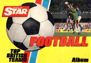
Having launched in 1978, the Daily Star felt confident enough to chance its arm in the football sticker market just three years’ later.

Although it would turn out to be a one-off, ‘Top British Teams’ was a decent effort from the newcomer.

Peter Batt, Chief Sports Columnist of the Daily Star, misjudged his audience in the foreword, however, by pitching it more to adults rather than the accepted target market of kids:

“Middle aged dads browsing through these pages will be instantly reminded of those magical pre-television days when the football circus came to town once every fortnight.

“If I close my eyes I can still inhale the steamy aroma of wet mackintoshes on the crowded top deck of the bus transporting us to wonderland.”

With 412 stickers, the Star opted for two First Division players to a sticker – slightly bigger than the Scottish versions we became accustomed to with Panini. Most were paired in the same clubs but occasionally you would get a Coventry player (Mick Coop) with a Nottingham Forest (Garry Birtles) or David Langan (Birmingham City) with Nicky Reid (Manchester City).

Where the newspaper differentiated from conventional albums was in the shape of their landscape publication, which gave them space for 14 individual player shots (as opposed to 13 from FKS and 12 from Panini that season).

With room for an extra squad member or two, Top British Teams featured a fresh-faced Ian Rush in what Americans would call his ‘rookie card’.

Nominally the players were ordered alphabetically but Ryan came after Suddaby for Brighton and Bannister after Hunt for Coventry when spelling went awry. There is even a rare shot of Clive Allen in an Arsenal shirt... albeit shoved in between Peter Nicholas and Neil Smilie at new club Crystal Palace.  

Claudio Marangoni (Sunderland) and Steve Archibald (Tottenham) compete for the worst superimposing job, the latter of which looks like his head has been placed on Lou Ferrigno’s body.

Claudio Marangoni, Steve Archibald and Garth Crooks

Selected Division Two sides were afforded 12 smaller-sized stickers (Chelsea, Newcastle, Swansea, Sheffield Wednesday, West Ham) while 11 stickers were given out each to Aberdeen, Celtic, Dundee United and Rangers in the Scottish mix. These were sold as four to a sticker.

A swanky competition finishes the album, to win a complete ‘Video Outfit’ - in conjunction with JVC - by naming your best Great Britain team and a slogan for them! A closing date of November 30, 1980 indicates the album came out early season, meaning a lot of credit should be given for putting together, in the main, a worthy first effort.

Less credit goes to Topps for their album-less Footballer ’81 set.

Topps/A&BC had previously brought out series after series of impressive individual player cards but the latest effort would prove the beginning of the end (as just one more set was produced for English football thereafter before the US company took a lengthy hiatus from the UK).

Just as Panini would innovate from Modena and then transfer those ideas abroad, Topps’ US head office would set the guidelines for any tinkering to their products. So it went, Footballers ’81 imitated the same three-players-to-a-card format being used for American sports at the time.


Notwithstanding some bizarre card ordering, the basic premise saw players divided into club sides based on the 1979-80 First Division placings. In between fourth-placed arsenal and Nottingham Forest, in fifth, were the top scorers for the previous season’s Division One teams.

Leeds United and Norwich City were separated by England players; Manchester City and Stoke City were bracketed by internationals from Scotland, Northern Ireland, Republic of Ireland and Wales; at the end were an assortment of Division Two players.

So far so moderate.

But then you find Larry Lloyd marooned from his Nottingham Forest team-mates, in with Manchester City. Quite why Billy Gilbert of Crystal Palace and Gary Owen of West Bromwich Albion are stuck together before the Second Division players is another mystery.

I will spare Topps’ blushes and leave their ‘out of ordering’ there.

Known as ‘pink backs’ (each Topps set used a different colour on the reverse to differentiate itself), Footballer ’81 packs were an attractive offering to any would be collector: nine picture cards (albeit three cards divided into three each), plus one of 18 ‘Super Star Posters’ and a stick of bubble gum.
Problems only start to arise when one looks deeper into the collection.

With just 198 mini-cards to the set, there really is no need for some of the players to crop up three times (as the likes of Paul Mariner, Glenn Hoddle and John Robertson do for their club, country and as last season’s top scorer).

Some of the photo selections also leave a great deal to be desired. Manchester United’s Ray Wilkins in a Chelsea kit (whom he left in the close season of 1979) appears quite reasonable compared to Southampton’s Kevin Keegan in a Liverpool shirt (a club he departed in 1977).

Brian Kidd would be forgiven for struggling to remember which club he was playing for at that time as he features on a Bolton Wanderers club card in painted on, badgeless, kit as well as on a top scorer card for Everton in Manchester City apparel.

I could go on... but it would be easier to put this collection out of its misery.

As a postscript, Topps did bring out an album for its ‘Footballer’ set in 1981-82 but there was a reason that collection was to be their valediction in England.

With the sketchy competition outlined, it just leaves Panini’s ‘Football 81’. As a previous Football Attic post has already done this album justice, I will close with some embellishing from Peter Warsop, who was the sales and marketing manager at WH Smith Distributors at the time, responsible for, among many other publishers, the sales, marketing and physical distribution for Panini UK:

“Nineteen seventy eight was a great year for Panini on football. As well as the World Cup we sold over 80 million packets of stickers on the Panini ‘Football 78’.  Nineteen seventy nine was down 10% but 1980 and 1981 shot back up to above 1978 levels. During this period we did market collections heavily but I put the main growth contributor down to completely overhauling the distribution system; this was done by reducing down fairly considerably the numbers of wholesalers involved. Those that remained had to provide agreed levels of service to retailers and their performance was carefully monitored and performance reviews given at regular intervals. Both wholesalers as well as retailers were put under some pressure to reward our marketing investments and due to the high volumes being achieved this worked in everyone’s favour.”


With the Daily Star bowing out after one year and FKS and Topps signing off in 1981-82, the path was well and truly clear for Panini to dominate for years to come.

Got any memories about the cards and stickers you collected back in 1980/81? If so, drop us a line and tell which collections you favoured most or those elusive players you needed to complete your sets!

Meantime, as ever, our sincere thanks to Greg Lansdowne for his wonderful blog post, and don't forget, you can buy Greg's book, 'Stuck on You: The Rise & Fall... & Rise of Panini Stickers' from Amazon UK and all good book stores right now (prices vary).

See also:

Friday, 12 June 2015

Jon Mills: The Subbuteo Years

Many of us have personal memories of playing Subbuteo and owning various teams and accessories, but Jon Mills has turned his into a guest post that captures the spirit of those innocent times. See how many chime with your own Subbuteo memories!

I’d set them all out carefully before I ran downstairs for breakfast. Mum had been calling me for ages and I knew we were running late but I needed to get the formations right. It was Brazil v Peru and I’d be spending most of the day at school looking forward to it. Looking over my shoulder one more time I took in the wonderful sight of 20 round discs on the green baize on my bedroom floor and the two keepers – their bodies arched back in full stretch, a long green handle protruding out the back of each.

I loved Subbuteo so much. I played it every single evening and being a bit too young to go out on school nights and only having older sisters, I would happily immerse myself in glorious battles between fierce local rivals or exotic sounding countries... It had never bothered me that I was technically playing against myself; in my head it was all about the two teams on the floor.

All through Maths I would be giving the game the appropriate media build-up in my head, all through history I would be pretending to be Zico discussing the game.

And so when the bell rang and I got home, I was straight upstairs for kick-off. It was still light so no need for the floodlights. And then I saw it.

The carnage and the horror. MUUUUMMMM!!

She’d said nothing as she’d driven me home from school. Like a cold-hearted killer, had she no remorse? Were their lives so cheap?

“Oops, sorry, I got a few with the hoover”

And so it was to be, Brazil’s already technical advantage was now physical as three of my Peru back line were now shorter than the rest of the team, huge balls of clear glue around their ankles. For those who had escaped the clean break there lay the cruel fate of disability. The left winger was leaning so far back he was looking more at the ceiling than the game and the playmaker seemed troubled by the horrors he’d witnessed earlier that day.

They lost 4-0.

There must be millions of us with stories like that. I didn't really have the awareness back then to know how popular the game was but I’d imagine that most of the kids in my road will have played it at some point.

By the time it entered my life it had come a long way from its origins in 1947. Those first lads would have enjoyed seeing paper nets being creased by thumping 30-yard shots from cardboard players weighed down by buttons. They wouldn't have stood a chance against me and my plastic army....

Its materials seemed crude until as late at the early-60s when the arrival of plastic moulded players finally sounded the death knell for its bitter rival Topfooty. Once it had moved to the top of the league it showed little sign of weakness, expanding its range towards accessories – all pointless to the game, all essential for the experience.

No, by the time of the early Eighties, you could have Real Madrid against Ajax on Astroturf, floodlights beaming down on the police horses that kept the cheering masses of the terraces at bay. All at a price of course. For most of us, the sight of stunningly painted crowd figures crammed into steep banks of well lit grandstands never got further than the TV adverts that taunted us so.

My memories would be spending long Saturday afternoons inhaling paint fumes as I carefully painted each individual naked crowd figure. The first few would have been detailed with delicate attention to detail – the later ones would be daubed in blues and browns as the novelty wore off and the fumes kicked in.

The stands were expensive so I made do with terracing, the crowd kept from the pitch by plastic fencing in case they took it upon themselves to misbehave. My dad lovingly made a wooden stand with built in floodlight which even after Father Christmas had delivered me two official stands still looked a million times better.

In the corner stood a floodlight which got very hot very quickly. They were expensive too so the opposite corner had a torch taped to a chair. The goals evolved from basic straight-lined to glorious World Cup design with green nets, no less, and the ball could now be purchased in bright orange should a blizzard unexpectedly strike my bedroom. Good grief, what more could a kid want?

And so, hour after hour I would play on my own a game designed for two. But I didn't care... and I twisted the rules... the ref didn't seem to care anyway - he could never keep up with play. I’d reach over stands to flick in crosses, knocking spectators down the steps in an avalanche then try to stab in a winner whilst simultaneously attempting to save it with the usually badly repaired goalie.

If you were lucky like me, your cloth pitch was nailed to hardboard and your goals held down with drawing pins. If you weren't that lucky, most goalmouth scrambles resulted in players facing tsunami sized bobbles in turf and the goal moving several yards backwards as the keeper got stuck in the net. The lack of goalmouth technology always threw the decision back your way – often resulting in a random throw-in to keep the momentum of the game.

When the eyelids got harder to lift and the scoreboard reached 9 and could turn no more, I would methodically place each of the players back in their polystyrene boxes. I don’t remember many toys being looked after so well by me – I think I was truly smitten.

And for all of us who would have given a smile at the news in 2012 that it was back in production, we must surely have also given a nostalgic sigh at the thought of it trying to challenge in a market saturated by video games.

We are more likely to hear our children shouting that the wi-fi is down than ever hear them complain their entire defence has been maimed by a hoover.

Their loss.

-- Jon Mills

Our enormous thanks to Jon for sending us such evocative memories of Subbuteo. If you've got any of your own, why not write your own blog post and send it to us? You'll find our contact details here, so do get in touch! 

Thursday, 11 June 2015

Collectables in 1980/81: Part 1

Once again it's our absolute pleasure to welcome back Greg Lansdowne who this time takes us on a sticker-packed trip down Memory Lane to the start of the 1980's. Here's Part 1, with the concluding part coming soon to The Football Attic website.

By the time of the 1980-81 season, resistance to Panini’s allure in the football collectables market seemed futile.

An irresistible mix of self-adhesive stickers, up-to-date strips, official club badges (in foil!) – all readily available to a hypnotised audience – made Panini the album to collect.

And yet…

FKS and Topps had been left bloodied and bruised following the entry of Panini into the UK mix from the late 1970s. Prior to that, the pair had dominated the collectables scene with their picture stamps and card sets respectively (Topps having bought out A&BC in 1975).

Rather than bowing out gracefully they carried on for the 1980-81 campaign, like washed-up boxers getting off the canvas on the count of nine to take another beating.

Panini’s ‘Football 81’, Topps ‘Footballers ‘81’ and FKS’ ‘Soccer 81’. What more could any collector need?

Why, the ‘Daily Star Top British Teams Football Album’, that’s what.

Each of Panini’s rivals provided a style of their own but none came anywhere near to putting up an offering likely to compete with the market leader.

It is possible to encapsulate this collectables season in one player: Peter Withe.

The legendary striker had just signed for Aston Villa that summer, at the start of a season to remember for the Villans.

Looking back at that Championship-winning squad in Panini’s double page spread, there sits Withe, in the bottom row of the second page, looking resplendent in the claret and blue outfit for which he is best known.

From this collectables high point, it quickly descends among the rivals.

While Panini traditionally waited until January to get their album out – ensuring the current season’s kits could be utilised – the rush to be first to market among competitors had more negatives than upsides.

Hence, Withe appeared in Newcastle United kit – from where he had moved in the summer of 1980 – in the Daily Star album. Topps opted to paint a claret and blue strip over one of Withe’s many former outfits.

Neither of these were satisfactory but FKS really pulled the stops out when it came to committing a Peter Withe fashion faux pas. If it wasn't bad enough to use a picture of the forward in the shirt of local rivals Birmingham, Withe had left that club in 1976 and played for a further two clubs since (Nottingham Forest and Newcastle).


Despite this oversight (among others), FKS did put up a reasonable showing with their Soccer 81 album. At 450 stickers, this was a comprehensive set that is mostly (if not solely) let down by copyright issues. With Panini having long since agreed deals with the English and Scottish Football Leagues, as well as their respective players’ associations, FKS needed to tread carefully.

As a result, the club badges are artist’s impressions – with varying degrees of inauthenticity.
Leicester City’s resembles a primary school art project; Manchester City’s elaborate badge was just too much like hard work; by the time they got to West Ham United they had completely lost interest!


Although the desire of Panini’s competitors to get their collections out early meant a large chunk of the head shots were taken from the previous season’s press call, this wasn’t as much of a problem at the time, as it was less noticeable with kits barely changing from season to season.

Except Brighton & Hove Albion had made a drastic alteration, for example, ditching their blue and white stripes in 1980-81 for an all blue shirt, making it obvious FKS and Daily Star were using dated photos from 1979-80.

‘Soccer 81’ opened with a review of the previous season, plus a swift welcome from Bobby Charlton at the bottom of the article (“I hope you enjoy collecting and swopping Soccer 81”). Also featuring a competition tie-in with Charlton’s soccer schools, the England great would later shift allegiance to Panini as the decade went on.

A continuing issue (not quite on the scale of the FKS ‘Soccer Stars 80’ album) was the presence of two clubs sharing each double page. It saved on paper but was not pleasing to the eye.

As has been recounted in other articles (as well as in my book ‘Stuck On You’) one of the more piquant aspects of these old albums (for the anally retentive football fans among us) is the errors that, pleasingly, crop up quite regularly.

In what one can only assume was an undetected cock-up by a photographer when captioning, Gordon Cowans appears as both himself and Des Bremner in not just ‘Soccer 81’ but also the Daily Star album.


Eccentric kit choices are also to the fore with, for example, Plymouth Argyle’s Brian Bason in a Chelsea shirt, despite having left the Blues in 1977.

Scottish clubs are featured prominently in equally-proportioned stickers to their English counterparts. To distinguish them, they are bordered by Scottish flags – except FKS forgot to add them in some instances, such as Paul Sturrock of Dundee United.


Similarly, a section of ‘USA Star Players’ (with players from the NASL) were framed by American flags, giving us a rare opportunity to collect UK domestic stickers of Franz Beckenbauer and Gerd Muller among others.

FKS were pioneers in the recycling movement by offering a discounted Umbro sports bag – as endorsed by Gary Owen – in exchange for 20 empty packets.

While Panini benefited from the huge promotional push of giving the ‘Football 81’ album away in ‘Shoot!’, FKS carried on their relationship with ‘Scoop’, - a comic that eventually ceased publishing in October 1981, the same season in which FKS also gave up the ghost.


Greg Lansdowne concludes his round-up of the collectables scene of 1980/81 later this week here on the Attic website. Meantime, our huge thanks to Greg, and to Alan Jenkins of Football Cartophilic Football Exchange for unearthing the above image of the rare FKS ‘Soccer 81’ album 'free with Scoop'.