Panini’s first foray into the world of annual UK sticker collections began with Football 78. Its bright red cover featuring action photos neatly sectioned into the hexagonal patches of a big football was a beacon for kids across the country to go out and fritter away what little pocket money they had at the time.
For many sticker collectors, this was where it all began - the start of a lifelong obsession. The Queen's Silver Jubilee had been and gone, and now it was time to celebrate something altogether different: the glorious sport of Football itself.
First Division pages and stickers
The team pages came next – two for each club with spaces for seventeen stickers each. Strangely in this first domestic Panini album we see an odd reluctance to fit in an extra player on the first page to create a uniform layout. Note the odd row of three rather than four where the manager and goalkeeper images reside…
The double-page spread has a familiar look for those that remember Panini’s later efforts, but in this early period the preference was to show biographies of each player in a single block on the second page rather than individually below each player’s picture.
There was also the statistics block situated between the badge and team photo; a mini-feast of facts and information for the knowledge-hungry child wanting to know a club’s record attendance or the change colours of Wolverhampton Wanderers.
As for the stickers themselves, the ’78 design was that of a red window frame with English flag, team name and badge at the top and player name at the bottom. Team badges were of the hard gold foil variety while team pictures used a similar design to those used for the players.
What’s notable about the player photos in this early Panini vintage is that each team member wasn't necessarily seen wearing the same shirts. In many cases you can pick out two or even three different shirt designs per team, something Panini made a point of correcting to a large extent later on.
Second Division
Subsequent Panini albums may have dared give you a glimpse of life in Divisions Three or even Four, but it's only the second tier of English football that was spotlighted here. Again there was another results chart to complete (half of it already having been done for you) before the minimal format of badge-statistics-team picture rolled out across six pages.
Here we get our first glimpse of the double foil badge – a regular-sized sticker split in two for twice the pleasure. Even though the Second Division badges were, in reality, only half the size of their First Division equivalents, there was something undeniably joyful about getting two on the one sticker.
As for the teams listed, there was an eclectic mix of the rising stars, the fallen wonders and the perennial water-treaders. Premier League stalwarts such as Bolton, Fulham and, yes, even Tottenham Hotspur sat cheek-by-jowl alongside teams like Bristol Rovers, Orient and the previous season's Division Three champions Mansfield Town.
Scottish Premier Division pages
If you think there's a two-tier structure in the SPL today, that was nothing compared to Panini's view of the Scottish Premier Divisiom in 1978. Aberdeen may have been first in alphabetical order, but there was a pecking order to observe. First came Celtic and Rangers, treated royally to the same double-page spread of their English counterparts. Everyone else followed and had to make do with only a single page, if you don't mind.
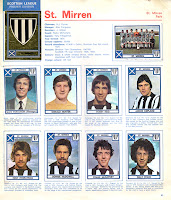
Hardly fair treatment, really, especially as that only left enough room for seven players to accompany the manager, club badge and team picture. Still, at least we got a fair selection of the pale, pasty-skinned and wild-haired talent making a name for itself north of the border, as well as the ubiquitous half-completed results grid.
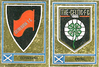
Sadly no Scottish First Division pages were included in this collection – they were to come in later years – but at least the strange array of Scottish Premier Division club badges made up for it. Celtic's badge looks a good 15 years ahead of its time, Clydebank's looks like it's been extracted from the cover of the Communist Manifesto while St Mirren seem to have settled for something scribbled on the back of a fag packet by Alex Ferguson himself.
Curiosities
Aside from the ongoing 70's competition to see 'who looks more like Graeme Souness than Graeme Souness', there's much to please the idle browser of this album. Sir Alf Ramsey makes an appearance as Birmingham City manager (Panini politely leaving out the word 'Caretaker' for such an undoubted legend of the game), while Everton's team picture appears to have been taken on a 1:3 hill.
Phil Thompson's lovely head of hair can only, in our opinion, be put down to him visiting the same stylist as Wendy Craig, star of BBC TV's 'Butterflies' whereas the winner of the award for the 'Too-Frightening-For-Words Pose' undoubtedly goes to QPR's Stan Bowles. 'Most Overlooked Badge'? That must go to the one worn by many of West Bromwich Albion's players… anyone know anything about this?
 As for the team trying hardest to look professional in its team picture, that must surely go to the aforementioned Clydebank who all appear to be wearing the biggest stitched-on numbers ever on their red tracksuit tops. A fine effort there, we're sure you'll agree.
Back cover
A never-more-70's hand-drawn vignette depicted as if zooming away from view in a vivid red-orange-yellow colour scheme. A bit like the opening titles to a Lew Grade British spy thriller series shot through the prism of an official FIFA World Cup film. Kind of.
For many sticker collectors, this was where it all began - the start of a lifelong obsession. The Queen's Silver Jubilee had been and gone, and now it was time to celebrate something altogether different: the glorious sport of Football itself.
Inside, we get an early sight of two elements that would become familiar in later years: a grid for filling in First Division results (some of which were already filled in for you up to October 15th 1977) and the trophy page with spaces for stickers of the FA Cup, League Championship Trophy and the two Scottish equivalents. Of those four stickers, only the FA Cup and Scottish Cup were in gold foil for reasons we’re still trying to fathom out.
The team pages came next – two for each club with spaces for seventeen stickers each. Strangely in this first domestic Panini album we see an odd reluctance to fit in an extra player on the first page to create a uniform layout. Note the odd row of three rather than four where the manager and goalkeeper images reside…
The double-page spread has a familiar look for those that remember Panini’s later efforts, but in this early period the preference was to show biographies of each player in a single block on the second page rather than individually below each player’s picture.
There was also the statistics block situated between the badge and team photo; a mini-feast of facts and information for the knowledge-hungry child wanting to know a club’s record attendance or the change colours of Wolverhampton Wanderers.
As for the stickers themselves, the ’78 design was that of a red window frame with English flag, team name and badge at the top and player name at the bottom. Team badges were of the hard gold foil variety while team pictures used a similar design to those used for the players.
What’s notable about the player photos in this early Panini vintage is that each team member wasn't necessarily seen wearing the same shirts. In many cases you can pick out two or even three different shirt designs per team, something Panini made a point of correcting to a large extent later on.
Second Division
Subsequent Panini albums may have dared give you a glimpse of life in Divisions Three or even Four, but it's only the second tier of English football that was spotlighted here. Again there was another results chart to complete (half of it already having been done for you) before the minimal format of badge-statistics-team picture rolled out across six pages.
Here we get our first glimpse of the double foil badge – a regular-sized sticker split in two for twice the pleasure. Even though the Second Division badges were, in reality, only half the size of their First Division equivalents, there was something undeniably joyful about getting two on the one sticker.
As for the teams listed, there was an eclectic mix of the rising stars, the fallen wonders and the perennial water-treaders. Premier League stalwarts such as Bolton, Fulham and, yes, even Tottenham Hotspur sat cheek-by-jowl alongside teams like Bristol Rovers, Orient and the previous season's Division Three champions Mansfield Town.
Scottish Premier Division pages
Hardly fair treatment, really, especially as that only left enough room for seven players to accompany the manager, club badge and team picture. Still, at least we got a fair selection of the pale, pasty-skinned and wild-haired talent making a name for itself north of the border, as well as the ubiquitous half-completed results grid.
Sadly no Scottish First Division pages were included in this collection – they were to come in later years – but at least the strange array of Scottish Premier Division club badges made up for it. Celtic's badge looks a good 15 years ahead of its time, Clydebank's looks like it's been extracted from the cover of the Communist Manifesto while St Mirren seem to have settled for something scribbled on the back of a fag packet by Alex Ferguson himself.
Curiosities
Aside from the ongoing 70's competition to see 'who looks more like Graeme Souness than Graeme Souness', there's much to please the idle browser of this album. Sir Alf Ramsey makes an appearance as Birmingham City manager (Panini politely leaving out the word 'Caretaker' for such an undoubted legend of the game), while Everton's team picture appears to have been taken on a 1:3 hill.
Phil Thompson's lovely head of hair can only, in our opinion, be put down to him visiting the same stylist as Wendy Craig, star of BBC TV's 'Butterflies' whereas the winner of the award for the 'Too-Frightening-For-Words Pose' undoubtedly goes to QPR's Stan Bowles. 'Most Overlooked Badge'? That must go to the one worn by many of West Bromwich Albion's players… anyone know anything about this?
 As for the team trying hardest to look professional in its team picture, that must surely go to the aforementioned Clydebank who all appear to be wearing the biggest stitched-on numbers ever on their red tracksuit tops. A fine effort there, we're sure you'll agree.
A never-more-70's hand-drawn vignette depicted as if zooming away from view in a vivid red-orange-yellow colour scheme. A bit like the opening titles to a Lew Grade British spy thriller series shot through the prism of an official FIFA World Cup film. Kind of.


